6 Mapping the bias index
However, while the plot above gives us a sense of counties where the State Patrol practices may deserve greater scrutiny, it is difficult to contextualize that information without a clear sense of where these counties are located. For example, we might want to know whether there are clusters of counties with particularly high or low values for the bias index. And if so, what might explain such patterns?
In short, counties are spatial units, and creating a visualization where we can explicitly situate those those spatial units in their geographic context might prove even more informative than a plot such as the one developed in the previous section (where counties are not situated in their spatial context). In short, it would be useful to display the bias index on county-level map of Colorado, which will allow us to get a clearer sense of the granular spatial distribution of the bias index across the state. This section will walk through the process of creating such a map.
6.1 Read in and view the shapefile of CO counties
In order to visualize data on the bias index we created on a map of Colorado counties, we need to first load a spatial dataset of Colorado counties into R Studio. A spatial dataset is simply a dataset that has geographic information attached to it; this geographic information can be used to render the data as a map.
Let’s load in the spatial dataset of Colorado counties that was provided to you at the start of the workshop. In particular, the spatial dataset that was provided to you is stored as a shapefile, which is a commonly used file format to store spatial datasets. We can load a shapefile into R Studio using the st_read() function from the sf package. Below, we’ll load in our shapefile, and assign it to a new object named co_counties_shapefile. Note that a given shapefile is comprised of several different files with various extensions; make sure that all of these files are in your working directory. However, the file name passed to the st_read() function must have an “.shp” extension, as below:
# Reads in shapefile and assigns to object named "co_counties_shapefile"
co_counties_shapefile<-st_read("tl_2019_08_county.shp")
Reading layer `tl_2019_08_county' from data source `/Users/adra7980/Documents/git_repositories/intro_GIS/co_counties/tl_2019_08_county/tl_2019_08_county.shp' using driver `ESRI Shapefile'
Simple feature collection with 64 features and 17 fields
geometry type: MULTIPOLYGON
dimension: XY
bbox: xmin: -109.0602 ymin: 36.99245 xmax: -102.0415 ymax: 41.00344
geographic CRS: NAD83Upon reading in the shapefile, you’ll notice that some metadata about the shapefile is printed to the console. We see that the shapefile has a geometry type of “multipolygon” (other possible geometry types are points and lines), that there are 64 rows and 17 columns in the dataset, and that its coordinate reference system is NAD83. Coordinate reference systems are important to consider if you plan to do spatial analysis that involves calculations with spatially defined attributes; since we don’t plan to do analysis of this nature (we’re only interested in using the shapefile as a way to visualize data), we can set this concept aside for the purpose of our workshop.
Now, let’s print the contents of co_counties_shapefile:
# Prints contents of "co_counties_shapefile"
co_counties_shapefile
Simple feature collection with 64 features and 17 fields
geometry type: MULTIPOLYGON
dimension: XY
bbox: xmin: -109.0602 ymin: 36.99245 xmax: -102.0415 ymax: 41.00344
geographic CRS: NAD83
First 10 features:
geometry STATEFP COUNTYFP COUNTYNS GEOID NAME NAMELSAD LSAD CLASSFP
1 MULTIPOLYGON (((-106.8714 3... 08 109 00198170 08109 Saguache Saguache County 06 H1
2 MULTIPOLYGON (((-102.6521 4... 08 115 00198173 08115 Sedgwick Sedgwick County 06 H1
3 MULTIPOLYGON (((-102.5769 3... 08 017 00198124 08017 Cheyenne Cheyenne County 06 H1
4 MULTIPOLYGON (((-105.7969 3... 08 027 00198129 08027 Custer Custer County 06 H1
5 MULTIPOLYGON (((-108.2952 3... 08 067 00198148 08067 La Plata La Plata County 06 H1
6 MULTIPOLYGON (((-107.9751 3... 08 111 00198171 08111 San Juan San Juan County 06 H1
7 MULTIPOLYGON (((-106.9154 3... 08 097 00198164 08097 Pitkin Pitkin County 06 H1
8 MULTIPOLYGON (((-105.9751 3... 08 093 00198162 08093 Park Park County 06 H1
9 MULTIPOLYGON (((-106.0393 3... 08 003 00198117 08003 Alamosa Alamosa County 06 H1
10 MULTIPOLYGON (((-102.2111 3... 08 099 00198165 08099 Prowers Prowers County 06 H1
MTFCC CSAFP CBSAFP METDIVFP FUNCSTAT ALAND AWATER INTPTLAT INTPTLON
1 G4020 <NA> <NA> <NA> A 8206547705 4454510 +38.0316514 -106.2346662
2 G4020 <NA> <NA> <NA> A 1419419016 3530746 +40.8715679 -102.3553579
3 G4020 <NA> <NA> <NA> A 4605713960 8166129 +38.8356456 -102.6017914
4 G4020 <NA> <NA> <NA> A 1913031921 3364150 +38.1019955 -105.3735123
5 G4020 <NA> 20420 <NA> A 4376255148 25642578 +37.2873673 -107.8397178
6 G4020 <NA> <NA> <NA> A 1003660672 2035929 +37.7810492 -107.6702567
7 G4020 233 24060 <NA> A 2514104907 6472577 +39.2175376 -106.9161587
8 G4020 216 19740 <NA> A 5682182508 43519840 +39.1189141 -105.7176479
9 G4020 <NA> <NA> <NA> A 1871465874 1847610 +37.5684423 -105.7880414
10 G4020 <NA> <NA> <NA> A 4243429484 15345176 +37.9581814 -102.3921613Notice that this looks very much like a typical dataset, one that we can also view in R Studio’s data viewer with View(co_counties_shapefile). The key element that makes this dataset different from a conventional dataset is contained in the “geometry” column. For each county, the geometry column contains a series of latitude/longitude pairs corresponding to that county’s borders in the “real world”. These lat/long pairs are processed by GIS software, and used to render a visual representation of a county’s geographic borders that reflects its “real-world” shape and location. When each row is rendered simultaneously, the result is a map of Colorado counties that can be used as a springboard for data visualization and analysis.
Within R Studio, we can leverage the geometry information in a shapefile to visually render its geographic attributes using functions from the tmap package. The code below uses the geometry information in co_counties_shapefile to render the Colorado county polygons as a map. First, we pass the name of the spatial object we’d like to map (co_counties_shapefile) to the tm_shape() function, and then use the tm_polygons() function to instruct the mapping utility that the spatial data in the “geometry” column is to be rendered as polygons:
## tmap mode set to plotting# Uses "geometry" information in "co_counties_shapefile" to create map of CO
# counties
tm_shape(co_counties_shapefile)+
tm_polygons()
You should see a map that looks like this in the “Plots” tab on the bottom-right of your R Studio interface.
Below, we’ll assign this basic map, which was rendered from co_counties_shapefile ,to an object named co_counties_map:
# assigns map of CO polygons to new object named "co_counties_map"
co_counties_map<-tm_shape(co_counties_shapefile)+
                    tm_polygons()
Now, whenever we want to retrieve the map, we can simply print the name of the object to which it has been assigned:
# prints contents of "co_counties_map"
co_counties_map
In using tmap to translate the geographic information in the “geometry” column of our spatial dataset of Colorado counties into a visual representation, we produced a static map; in other words, we cannot do things like pan around the map, or zoom in and out. However, if we want to render a dynamic map where such things are possible, we can simply use the tmap_mode() function to change the setting of the tmap environment to “view”, as below:
# Sets tmap mode to "view"
tmap_mode("view")
## tmap mode set to interactive viewingNow, if we open the co_counties_map object that we created earlier, tmap will render a dynamic and interactive map:
# Prints "co_counties_map" as a web map
co_counties_map
You will be able to view this interactive map in the “Viewer” tab on the bottom right of your R Studio interface. This interactive map is essentially a web map, and can easily be exported as an html file and embedded on a website (if we so choose).
If we want to switch back to making static maps, we can switch back to “plot” mode using the same tmap_mode() function:
# Switches tmap mode back to "plot"
tmap_mode("plot")
## tmap mode set to plottingOnce we’re back in “plot” mode, tmap will render spatial objects as static maps. For instance, if we open co_counties_map again, it will render as a static map:
# prints "co_counties_map" as a static plot
co_counties_map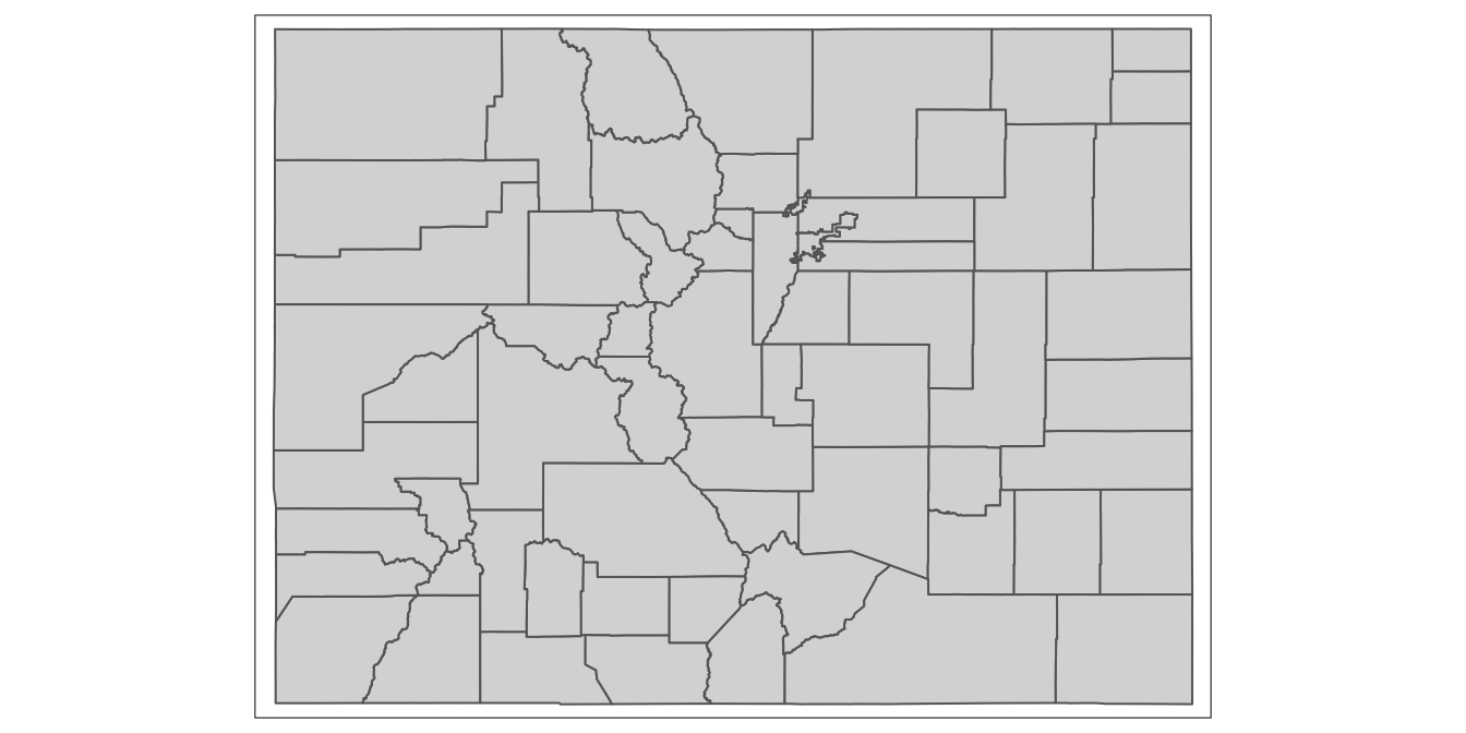
As we work with spatial data and maps in R Studio using tmap, we can easily toggle back and forth between “view” and “plot” modes, depending on our desired outputs.
6.2 Join co_counties_census_trafficstops to the shapefile of Colorado counties
Now that we’ve loaded and explored our spatial dataset of Colorado counties, let’s turn to the process of displaying the bias index on the map that we just rendered from our spatial dataset of CO counties.
In order to display our data of interest on the map of Colorado counties that we generated above, we must first join the data on the bias index to the spatial dataset; once the bias index data is in our spatial dataset, we can use tmap functions to render a map that displays this data on the county polygons.
We can implement the join between a spatial dataset and a tabular dataset in much the same way as we implemented a join between two tabular datasets above in Section 6.2 (between the traffic stops dataset and the census dataset).
Below, the first argument to the full_join() function is the name of our spatial object of Colorado counties; the second argument is the name of the object which contains the “bias_index” data (which we want to merge into the shapefile). Finally, the third argument indicates that we want to join these datasets together using the field named “GEOID” (which is the same in both datasets), as the join field. We’ll assign the expanded spatial dataset that results from the join to a new object named county_shapefile_biasIndex:
# Joins "co_counties_census_trafficstops" into "co_counties_shapefile"
# using GEOID as the join field; assigns the new joined dataset to a new
# object named "county_shapefile_biasIndex"
county_shapefile_biasIndex<-
  full_join(co_counties_shapefile,
            co_counties_census_trafficstops, by="GEOID")
Now, when we open county_shapefile_biasIndex, we should see the “bias_index” variable in the dataset, along with the “geometry” information needed to render a map of Colorado counties:
# prints contents of "county_shapefile_biasIndex"
county_shapefile_biasIndex
Simple feature collection with 64 features and 27 fields
geometry type: MULTIPOLYGON
dimension: XY
bbox: xmin: -109.0602 ymin: 36.99245 xmax: -102.0415 ymax: 41.00344
geographic CRS: NAD83
First 10 features:
NAME geometry bias_index STATEFP COUNTYFP COUNTYNS GEOID NAMELSAD LSAD
1 Saguache MULTIPOLYGON (((-106.8714 3... 0.5591577 08 109 00198170 08109 Saguache County 06
2 Sedgwick MULTIPOLYGON (((-102.6521 4... 3.0473002 08 115 00198173 08115 Sedgwick County 06
3 Cheyenne MULTIPOLYGON (((-102.5769 3... 3.1472044 08 017 00198124 08017 Cheyenne County 06
4 Custer MULTIPOLYGON (((-105.7969 3... -0.2021878 08 027 00198129 08027 Custer County 06
5 La Plata MULTIPOLYGON (((-108.2952 3... 0.2272495 08 067 00198148 08067 La Plata County 06
6 San Juan MULTIPOLYGON (((-107.9751 3... 0.8000000 08 111 00198171 08111 San Juan County 06
7 Pitkin MULTIPOLYGON (((-106.9154 3... 0.3336883 08 097 00198164 08097 Pitkin County 06
8 Park MULTIPOLYGON (((-105.9751 3... 0.3973331 08 093 00198162 08093 Park County 06
9 Alamosa MULTIPOLYGON (((-106.0393 3... -0.2620964 08 003 00198117 08003 Alamosa County 06
10 Prowers MULTIPOLYGON (((-102.2111 3... 3.2319999 08 099 00198165 08099 Prowers County 06
CLASSFP MTFCC CSAFP CBSAFP METDIVFP FUNCSTAT ALAND AWATER INTPTLAT INTPTLON
1 H1 G4020 <NA> <NA> <NA> A 8206547705 4454510 +38.0316514 -106.2346662
2 H1 G4020 <NA> <NA> <NA> A 1419419016 3530746 +40.8715679 -102.3553579
3 H1 G4020 <NA> <NA> <NA> A 4605713960 8166129 +38.8356456 -102.6017914
4 H1 G4020 <NA> <NA> <NA> A 1913031921 3364150 +38.1019955 -105.3735123
5 H1 G4020 <NA> 20420 <NA> A 4376255148 25642578 +37.2873673 -107.8397178
6 H1 G4020 <NA> <NA> <NA> A 1003660672 2035929 +37.7810492 -107.6702567
7 H1 G4020 233 24060 <NA> A 2514104907 6472577 +39.2175376 -106.9161587
8 H1 G4020 216 19740 <NA> A 5682182508 43519840 +39.1189141 -105.7176479
9 H1 G4020 <NA> <NA> <NA> A 1871465874 1847610 +37.5684423 -105.7880414
10 H1 G4020 <NA> <NA> <NA> A 4243429484 15345176 +37.9581814 -102.3921613
county_name County black_stop_pct black_pop_pct black_stops total_stops total_pop
1 Saguache County Saguache 0.7296607 0.1705030 20 2741 6108
2 Sedgwick County Sedgwick 3.4120735 0.3647733 26 762 2379
3 Cheyenne County Cheyenne 3.4358047 0.2886003 38 1106 1836
4 Custer County Custer 0.8474576 1.0496454 1 118 4255
5 La Plata County La Plata 0.6191950 0.3919455 70 11305 51334
6 San Juan County San Juan 0.8000000 0.0000000 1 125 699
7 Pitkin County Pitkin 0.8213552 0.4876670 4 487 17148
8 Park County Park 0.7943403 0.3970072 64 8057 16206
9 Alamosa County Alamosa 0.9602501 1.2223466 43 4478 15445
10 Prowers County Prowers 3.7458295 0.5138297 247 6594 12551
total_black_pop_over17 total_pop_over17
1 8 4692
2 7 1919
3 4 1386
4 37 3525
5 160 40822
6 0 571
7 69 14149
8 52 13098
9 142 11617
10 47 91476.3 Display the bias index on a map of Colorado counties
At this point, with our “bias_index” variable included in a spatially explicit dataset, we are ready to visualize this data on a map, and observe how our measure of bias in police stops varies geographically across counties.
6.3.1 Make a rough draft of a map
Let’s start by making the simplest possible map of “bias_index”. Recall that earlier, we drew the Colorado county polygons with the following:
# Uses tmap to render Colorado polygons based on geometry information in
# "county_shapefile_biasIndex" object
tm_shape(county_shapefile_biasIndex)+
  tm_polygons()
Now, to display actual data from the dataset on the Colorado county polygons, we can simply pass an argument to the tm_polygons() function. In particular, we can specify the column that contains the data we want to represent on the map, using the col argument to the tm_polygons() function. In our case, the name of the column that contains the data we want to display on the map is “bias_index”, so we will specify col="bias_index" within the tm_polygons() function:
# Creates map of "bias_index" variable from "county_shapefile_biasIndex"
# spatial object
tm_shape(county_shapefile_biasIndex)+
  tm_polygons(col="bias_index")
## Variable(s) "bias_index" contains positive and negative values, so midpoint is set to 0. Set midpoint = NA to show the full spectrum of the color palette.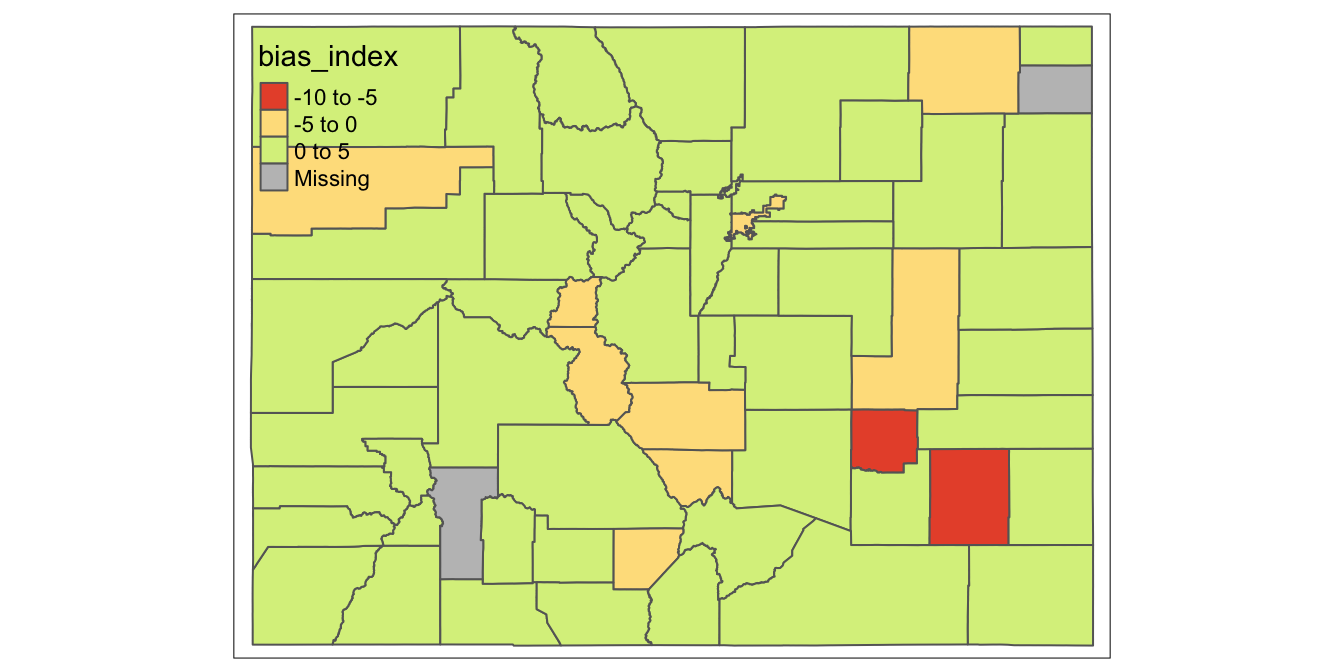
As you can see, this allowed us to display the “bias_index” data on the map of Colorado counties. Admittedly, this map is very rough; important elements of the map, such as the legend interval breaks and the color scheme, were chosen arbitrarily by tmap, and these arbitrary settings hinder the ability of the map to effectively convey information about the spatial distribution of “bias_index” across Colorado counties.
However, tmap allows us to customize our maps, and explicitly specify parameters that shape the map’s appearance. Let’s begin exploring some of these customization possibilities. In the code below, we still start out by passing county_shapefile_biasIndex to the tm_shape() function (so as to specify the spatial object we’d like to map), and passing col="bias_index to the tm_polygons() function (as before).
However, we’ll begin customizing the map by passing additional arguments to the tm_polygons() function:
- With respect to the color scheme, we’ll designate a yellow-to-red color palette with
palette="YlOrRd", and set 0 as the the point in the data distribution that corresponds to the midpoint of the palette (in other words, the the hypothetical county where “col_bias” is exactly zero will be displayed in the color palette’s median color). For more information on color options in R (including color and palette codes), see the useful R Color cheatsheet. - In the next three arguments to
tm_polygons(), we’ll begin customizing the map’s legend. SettingtextNA="No Data"specifies that the legend should label the category for counties with NA values on the bias index as “No Data”, rather than the default label, which is “Missing”. Settingn=5establishes that we want to group our data into five distinct intervals, which means our legend will have five breaks. Finally, settingstyle="jenks"specifies that we want to use the jenks algorithm to decide where to place those legend breaks (or in other words, how to break up the data into five distinct intervals). For more For more information on the Jenks Natural Breaks Classification, as well as other data partition algorithms, see here. - Finally, we call the
tm_layout()function, which allows us to customize the map’s layout; within this function, we setframe=FALSE(which removes the map’s frame, or bounding box) andlegend.outside=TRUE(which places the legend outside the map’s domain, so as to not interfere with the display of counties).
  tm_shape(county_shapefile_biasIndex)+
      tm_polygons(col="bias_index",
                  palette="YlOrRd",
                  midpoint=0,
                  textNA="No Data",
                  n=5,
                  style="jenks")+
      tm_layout(frame=FALSE,
               legend.outside=TRUE)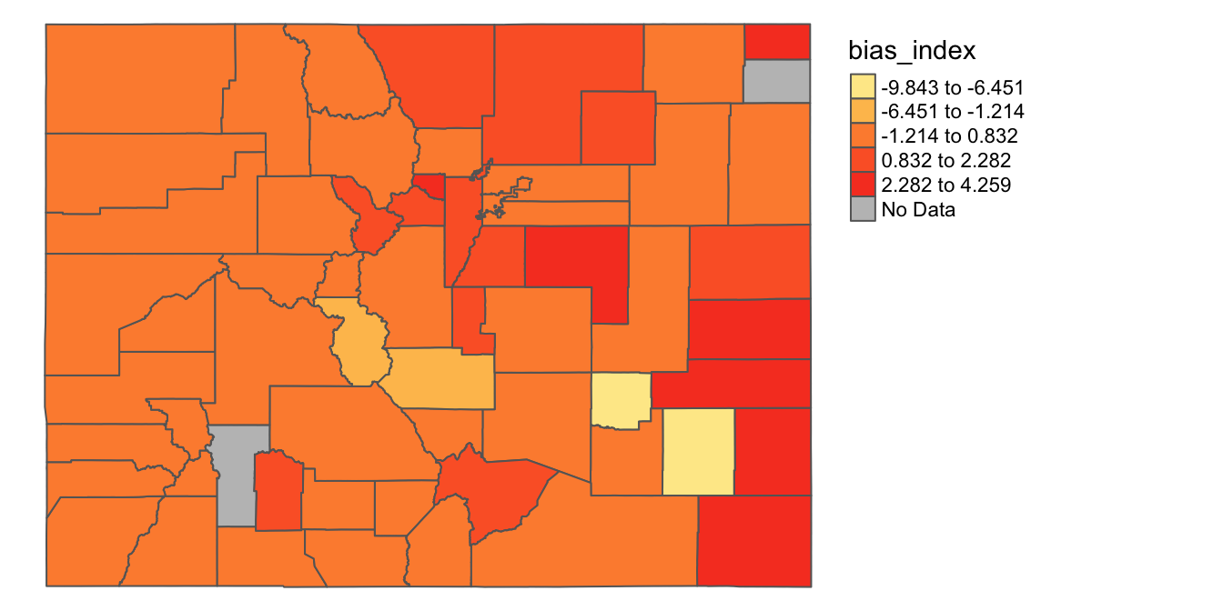
This is starting to look better; in the next two subsections, we’ll explore how to further control the map’s appearance by setting custom breaks and custom color schemes.
6.3.2 Make a map with custom breaks
Let’s say that instead of using the Jenks (or some other algorithm) to partition our data into intervals, we want to set our own data intervals. Doing so might make sense here, especially since we want to clearly differentiate counties with a bias index less than or equal to zero from those that are above zero. We can specify our legend breaks in a numeric vector (i.e. a sequence of numbers) passed to the breaks argument within the tm_polygons() function. Below, we set breaks=c(-10,-5,0,2,4,5), which indicates that we want our intervals to be from -10 to -5; -5 to 0; 0 to 2; 2 to 4; and 4 to 5. Note that the “c” before the sequence of numbers bounded by parentheses is actually a function, which is used to indicate that the sequence of elements that follows must be interpreted as a vector. Also, note that we’ve removed the style="jenks" argument that we used above, since we’re using custom legend breaks (rather than breaks implemented by the jenks algorithm). Other than those changes, other elements of the code below are the same as that used in the previous code block.
  tm_shape(county_shapefile_biasIndex)+
    tm_polygons(col="bias_index",
                palette="YlOrRd",
                midpoint=0,
                textNA="No Data",
                breaks=c(-10,-5, 0, 2, 4, 5))+
    tm_layout(frame=FALSE,
              legend.outside=TRUE)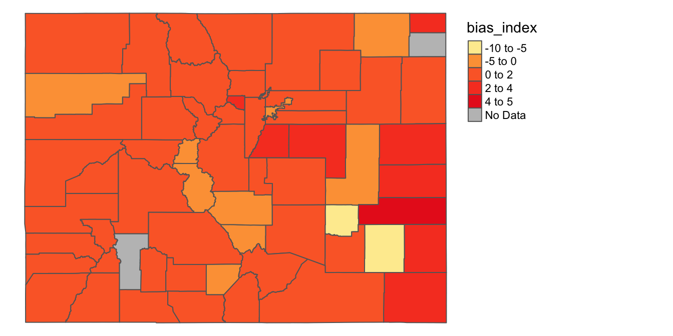
6.3.3 Make a map with custom colors
So far, we’ve been using a predefined color template (“YlOrRd”) to display the range of values on the map. While this color scheme might be a good start, it can sometimes be difficult to distinguish the colors on the map. One possible way to fix this might be to explore other possible predefined color schemes, and find one that makes colors easier to distinguish given the data we have. Another possibility is to specify our own colors for the intervals we want to map. In order to do this, let’s first first define a character vector, assigned to an object named my_colors, that contains the colors we want to use (once again, a reminder color names are available on the R Color Cheatsheet):
# defines vector of colors and assigns vector to an object named "my_colors"
my_colors<-c("white", "peachpuff", "red1", "red4", "navy")
Now, we can pass this vector as an argument to the tm_polygons() function. Instead of setting palette=YlOrRd (as above), we instead set palette=my_colors. The colors in the my_colors vector are assigned to the numeric intervals in order; that is, the interval from -10 to -5 is assigned the color “white” (the first color in the vector), the interval from -5 to 0 is assigned the color “peachpuff” (the second color in the vector), the interval from 0 to 2 is assigned the color “red1” (the third color in the vector), and so on. Everything else in the code remains the same as in the previous section:
tm_shape(county_shapefile_biasIndex)+
  tm_polygons(col="bias_index",
              palette=my_colors,
              textNA="No Data",
              breaks=c(-10,-5, 0, 2, 4, 5))+
  tm_layout(frame=FALSE,
            legend.outside=TRUE)
We can see that these colors are easier to distinguish, which makes it easier to quickly scan the map for relevant patterns.
It is also worth reminding ourselves that it’s possible to assign the maps we create using tmap to objects. For example, let’s assign the last map we created to a new object named traffic_bias_map_continuous:
# Creates map showing variation in "bias_index" across CO counties, and assigns
# the map to object named "traffic_stop_map_continuous"
traffic_bias_map_continuous<-
tm_shape(county_shapefile_biasIndex)+
  tm_polygons(col="bias_index",
              palette=my_colors,
              textNA="No Data",
              breaks=c(-10,-5, 0, 2, 4, 5))+
  tm_layout(frame=FALSE,
            legend.outside=TRUE)
Now, we can bring up this map whenever we need it:
# Prints contents of "traffic_stop_map_continuous"
traffic_bias_map_continuous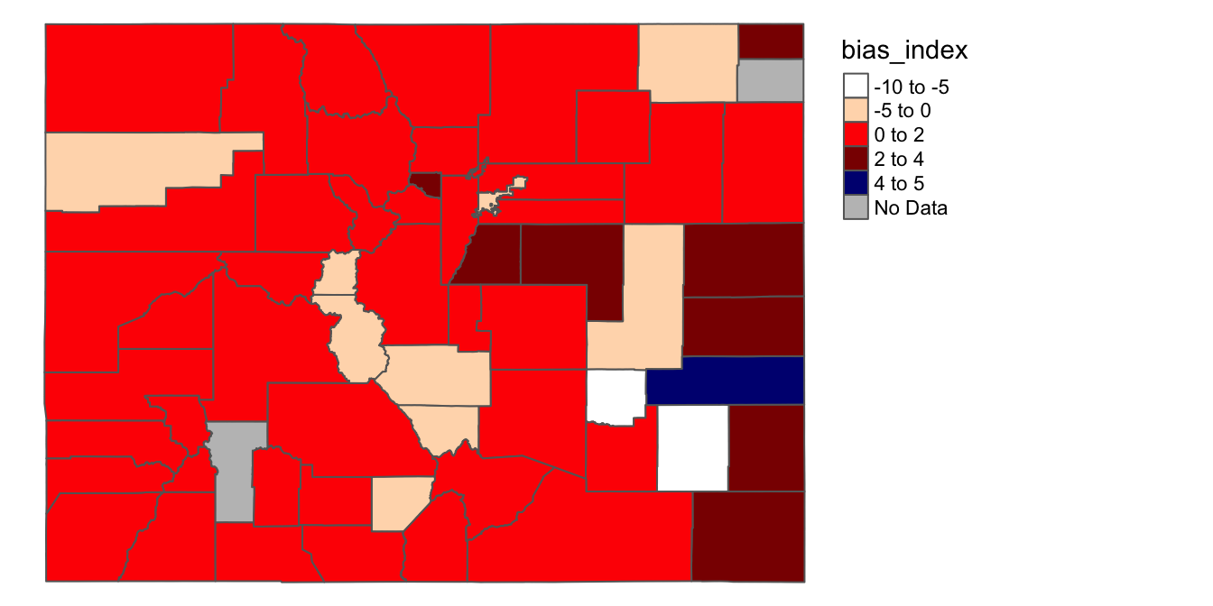
6.4 Make a categorical map
So far, we have been mapping the the bias_index variable, which is a continuous variable. This has the advantage of allowing us to visualize the full extent of variation in the bias_index variable. However, there are also other ways we might visualize the data. For example, we could transform bias_index from a continuous numeric variable into a categorical variable, and visualize this categorical variable on a map.
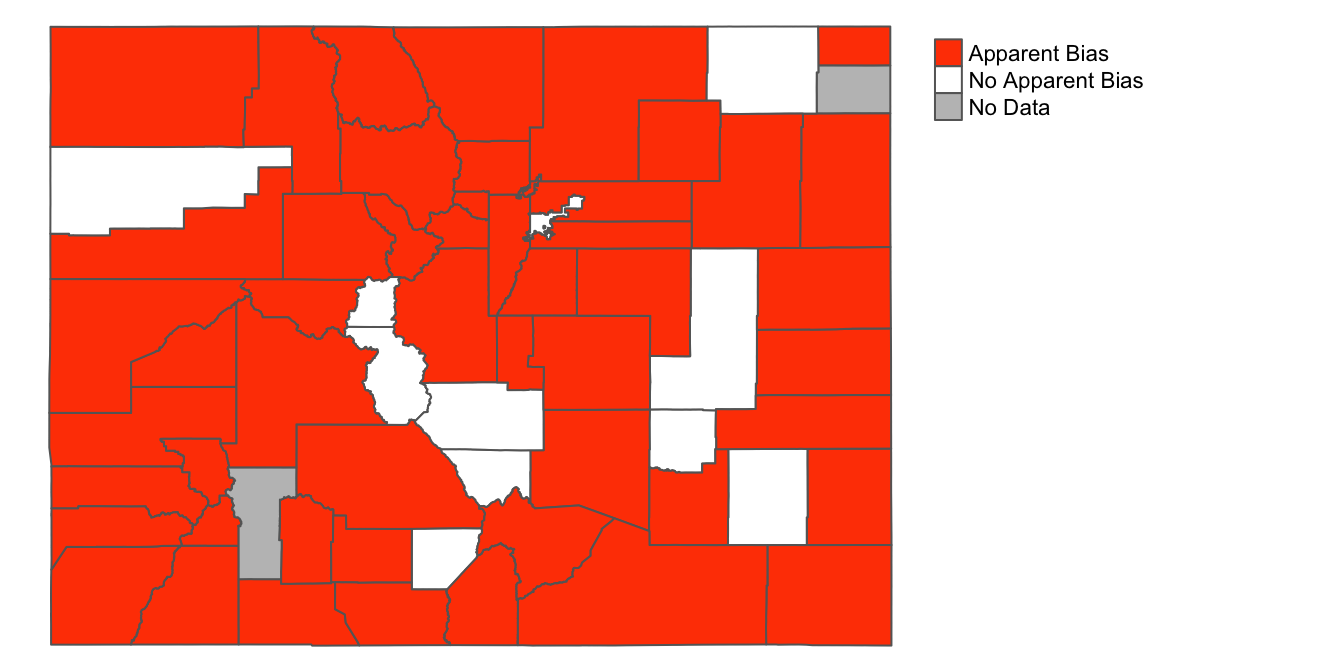
More specifically, let’s say we want to use a map to clearly distinguish the counties where racial bias in traffic stops appears to be a problem (where “bias_index”>0) and those counties in which it does NOT appear to be a problem (where “bias_index”<=0). On the one hand, this would throw out useful information on the variation of “bias_index”, but on the other hand, it could yield a more stark and focused map.
To build such a map, the first step is to create a new categorical variable, based on the continuous bias_index variable, within county_shapefile_biasIndex. In the code below, we take the existing spatial dataset assigned to the county_shapefile_biasIndex object, and then use the mutate() function to create a new variable named “apparent_bias.” This new “apparent_bias” variable is set to “Apparent Bias” for counties where “bias_index”>0, and set to “No Apparent Bias” for all other counties (i.e. where the bias index is less than or equal to zero). This is accomplished using the ifelse() function. The first argument to the ifelse() function is a given condition (here bias_index>0). The second argument specifies the value that the new “apparent_bias” variable should take when that condition is true; the third argument specifies the value that the “apparent_bias” variable should take when that condition is false. After creating and defining this new variable, we assign the changes back to the county_shapefile_biasIndex object, which overwrites the previous version of the dataset.
# Takes the existing dataset assigned to the "county_shapefile_biasIndex"
# object, and creates a new variable named "apparent_bias"; this variable takes
# on the value "Apparent Bias" where the "bias_index" variable is >0 and
# "No Apparent Bias" where it is less than or equal to zero; these changes
# are then assigned back to the "county_shapefile_biasIndex" object
county_shapefile_biasIndex<-
  county_shapefile_biasIndex %>%
            mutate(apparent_bias=ifelse(bias_index>0,
                                        "Apparent Bias",
                                        "No Apparent Bias"))
Let’s take a look at what the new variable looks like:
# prints contents of "county_shapefile_biasIndex"
county_shapefile_biasIndex
Simple feature collection with 64 features and 28 fields
geometry type: MULTIPOLYGON
dimension: XY
bbox: xmin: -109.0602 ymin: 36.99245 xmax: -102.0415 ymax: 41.00344
geographic CRS: NAD83
First 10 features:
NAME geometry bias_index apparent_bias STATEFP COUNTYFP COUNTYNS GEOID
1 Saguache MULTIPOLYGON (((-106.8714 3... 0.5591577 Apparent Bias 08 109 00198170 08109
2 Sedgwick MULTIPOLYGON (((-102.6521 4... 3.0473002 Apparent Bias 08 115 00198173 08115
3 Cheyenne MULTIPOLYGON (((-102.5769 3... 3.1472044 Apparent Bias 08 017 00198124 08017
4 Custer MULTIPOLYGON (((-105.7969 3... -0.2021878 No Apparent Bias 08 027 00198129 08027
5 La Plata MULTIPOLYGON (((-108.2952 3... 0.2272495 Apparent Bias 08 067 00198148 08067
6 San Juan MULTIPOLYGON (((-107.9751 3... 0.8000000 Apparent Bias 08 111 00198171 08111
7 Pitkin MULTIPOLYGON (((-106.9154 3... 0.3336883 Apparent Bias 08 097 00198164 08097
8 Park MULTIPOLYGON (((-105.9751 3... 0.3973331 Apparent Bias 08 093 00198162 08093
9 Alamosa MULTIPOLYGON (((-106.0393 3... -0.2620964 No Apparent Bias 08 003 00198117 08003
10 Prowers MULTIPOLYGON (((-102.2111 3... 3.2319999 Apparent Bias 08 099 00198165 08099
NAMELSAD LSAD CLASSFP MTFCC CSAFP CBSAFP METDIVFP FUNCSTAT ALAND AWATER INTPTLAT
1 Saguache County 06 H1 G4020 <NA> <NA> <NA> A 8206547705 4454510 +38.0316514
2 Sedgwick County 06 H1 G4020 <NA> <NA> <NA> A 1419419016 3530746 +40.8715679
3 Cheyenne County 06 H1 G4020 <NA> <NA> <NA> A 4605713960 8166129 +38.8356456
4 Custer County 06 H1 G4020 <NA> <NA> <NA> A 1913031921 3364150 +38.1019955
5 La Plata County 06 H1 G4020 <NA> 20420 <NA> A 4376255148 25642578 +37.2873673
6 San Juan County 06 H1 G4020 <NA> <NA> <NA> A 1003660672 2035929 +37.7810492
7 Pitkin County 06 H1 G4020 233 24060 <NA> A 2514104907 6472577 +39.2175376
8 Park County 06 H1 G4020 216 19740 <NA> A 5682182508 43519840 +39.1189141
9 Alamosa County 06 H1 G4020 <NA> <NA> <NA> A 1871465874 1847610 +37.5684423
10 Prowers County 06 H1 G4020 <NA> <NA> <NA> A 4243429484 15345176 +37.9581814
INTPTLON county_name County black_stop_pct black_pop_pct black_stops total_stops total_pop
1 -106.2346662 Saguache County Saguache 0.7296607 0.1705030 20 2741 6108
2 -102.3553579 Sedgwick County Sedgwick 3.4120735 0.3647733 26 762 2379
3 -102.6017914 Cheyenne County Cheyenne 3.4358047 0.2886003 38 1106 1836
4 -105.3735123 Custer County Custer 0.8474576 1.0496454 1 118 4255
5 -107.8397178 La Plata County La Plata 0.6191950 0.3919455 70 11305 51334
6 -107.6702567 San Juan County San Juan 0.8000000 0.0000000 1 125 699
7 -106.9161587 Pitkin County Pitkin 0.8213552 0.4876670 4 487 17148
8 -105.7176479 Park County Park 0.7943403 0.3970072 64 8057 16206
9 -105.7880414 Alamosa County Alamosa 0.9602501 1.2223466 43 4478 15445
10 -102.3921613 Prowers County Prowers 3.7458295 0.5138297 247 6594 12551
total_black_pop_over17 total_pop_over17
1 8 4692
2 7 1919
3 4 1386
4 37 3525
5 160 40822
6 0 571
7 69 14149
8 52 13098
9 142 11617
10 47 9147Now that we have created this new categorical variable, let’s go ahead and create a map that displays it on our map of Colorado counties. The code below looks very similar to the code used to map the original “bias_index” variable. The main difference is that instead of setting col=bias_index, we set the col argument equal to "apparent_bias (i.e. col="apparent_bias"). Another difference worth pointing out is that we use a different, bipartite color scheme (since there are now only two categories to map); this color scheme is defined by the vector c("orangered1", "white"). Finally, in the previous map, the legend’s title was taken from the name of the column that was mapped; here, having this title would be redundant, so we can remove the legend title using title="". We’ll assign this map to a new object named traffic_bias_map_categorical:
traffic_bias_map_categorical<-
  tm_shape(county_shapefile_biasIndex)+
      tm_polygons(col="apparent_bias",
                  title="",
                  palette=c("orangered1", "white"),
                  textNA="No Data")+
      tm_layout(frame=FALSE,
                legend.outside=TRUE)
If we print the contents of traffic_bias_map_categorical, we open a map that looks something like this:
traffic_bias_map_categorical