3 Building Maps in Quantum Geographic Information Systems (QGIS)
When you open up a new QGIS project, the interface will look something like this:
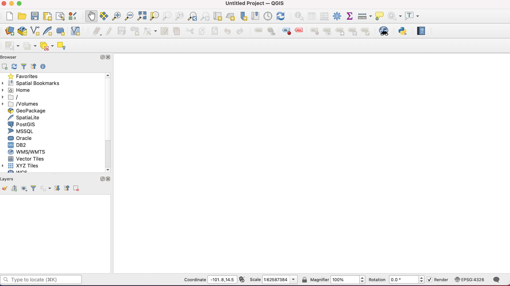
Figure 3.1: The main QGIS window
3.1 Add a spatial dataset (shapefile) to QGIS
To add a spatial dataset (and in particular, a shapefile) to QGIS, first select Layer from the top menu, scroll down to Add Layer and then select Add Vector Layer:
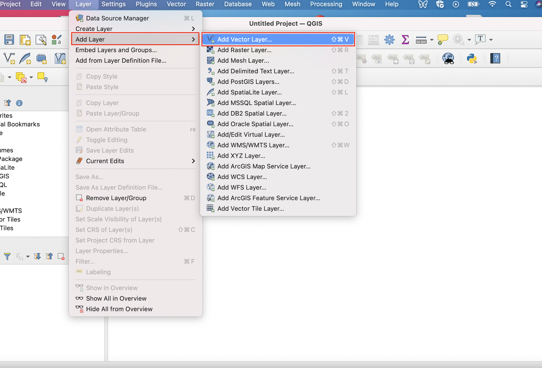
Figure 3.2: Navigating to the ‘Add Vector Layer’ Menu
This will open up the Data Source Manager|Vector dialog box. Under the Source tab, click on the ellipsis that is to the right of the box next to the Vector Dataset(s) label. This Browse button will open up another dialog box, from which you can navigate to the directory containing your shapefile.
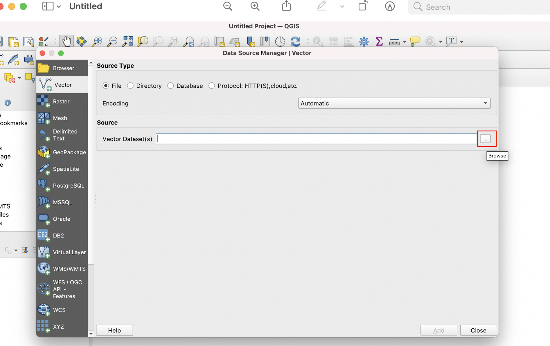
Figure 3.3: Click the ‘Browse’ button to navigate to your shapefile
.shp extension, and click Open.
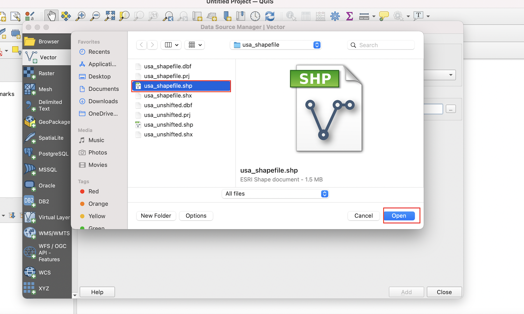
Figure 3.4: Select shapefile from directory
At this point, you will see the file path to the shapefile under the Source tab. Once you see this path, go ahead and click the Add button:
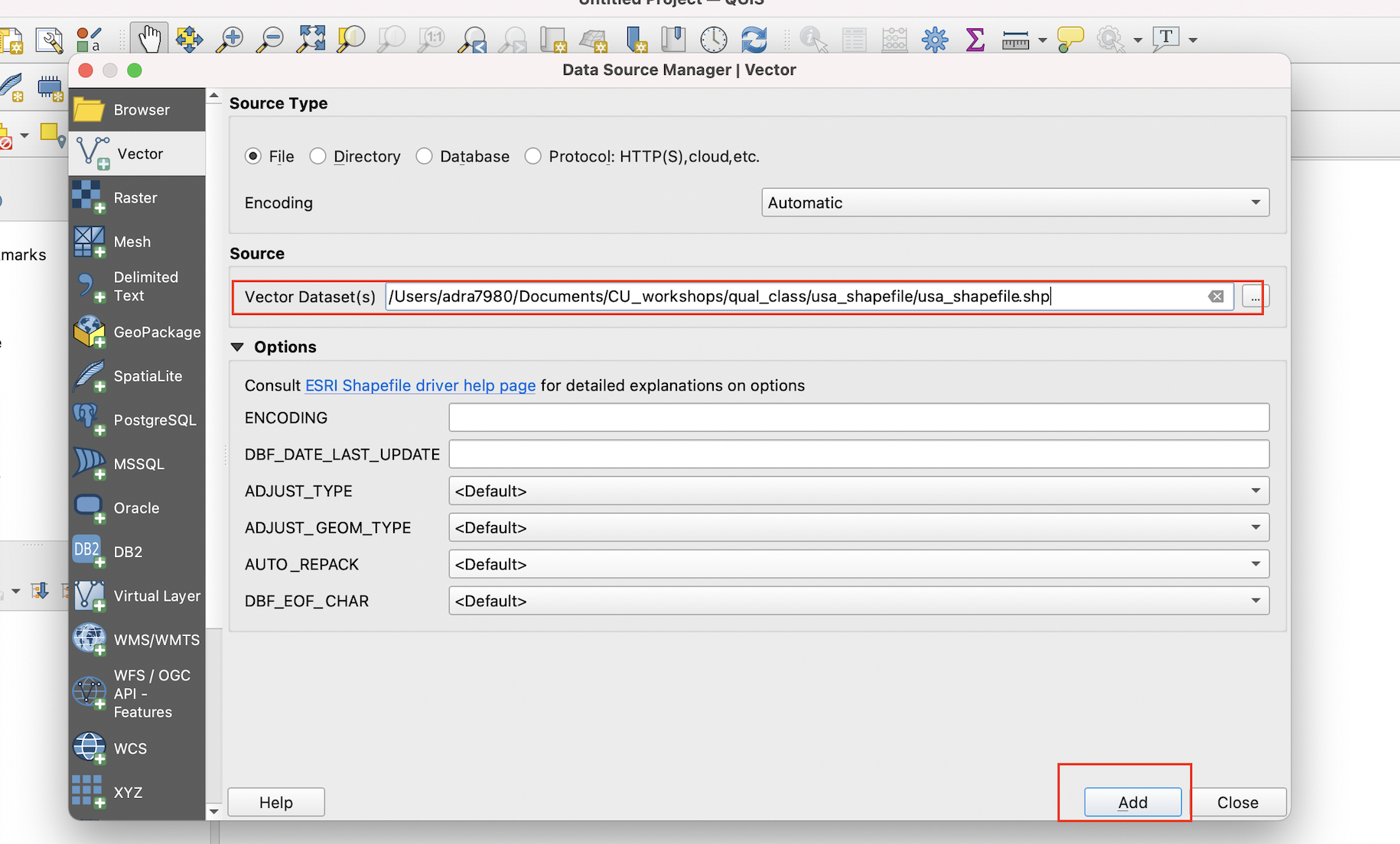
Figure 3.5: Confirm the shapefile’s path and click ‘Add’
Once the shapefile has been added, it will appear in the QGIS project window. Note that the color of the shapefile when it is first imported is arbitrarily set by QGIS, but this initial color can always be changed.
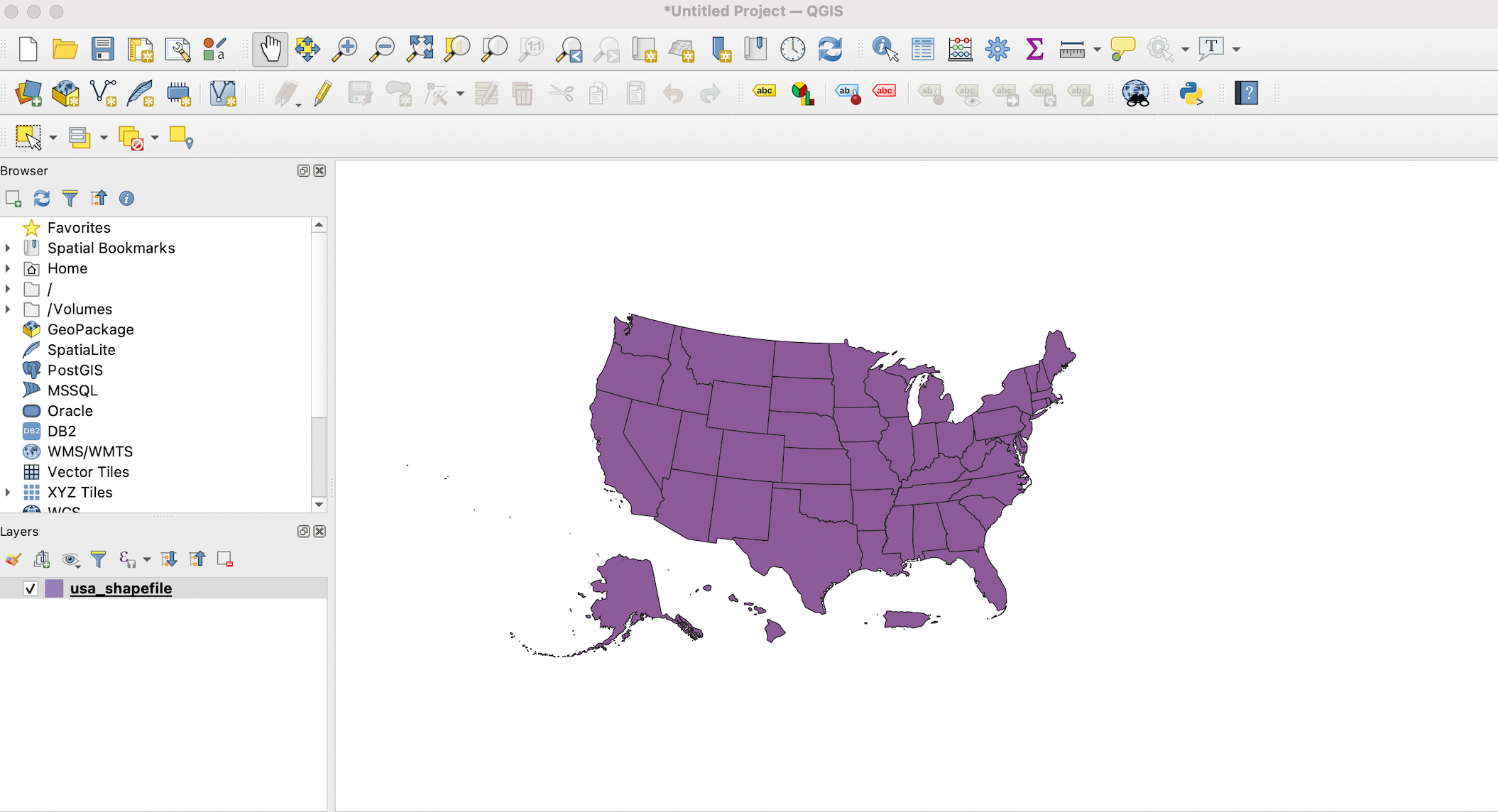
Figure 3.6: The rendered shapefile/spatial dataset rendered in the QGIS project window
3.2 Inspect the shapefile’s attribute table
To inspect the attribute table that is associated with the shapefile, right-click on the shapefile in the Layers window, and select Open Attribute Table.
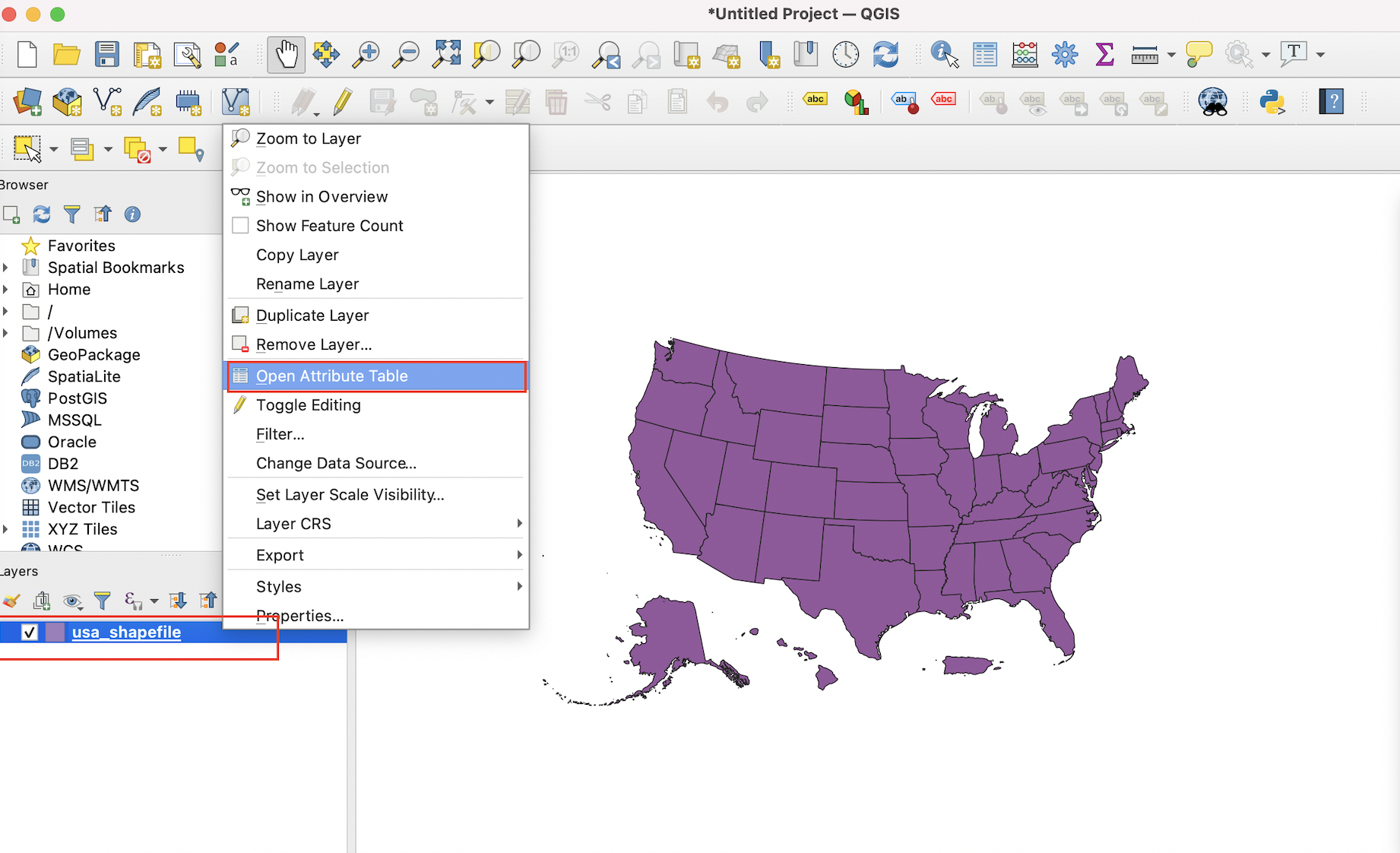
Figure 3.7: Open the the shapefile’s attribute table
When the attribute table is open, it will look something like this. When you select a record in the attribute table (by clicking on it), the corresponding geographic attribute will automatically be selected on the map (and vice versa). Here, we clicked on the Colorado record within the attribute table, which simultaneously highlighted Colorado on the shapefile’s geographic representation in the project window:
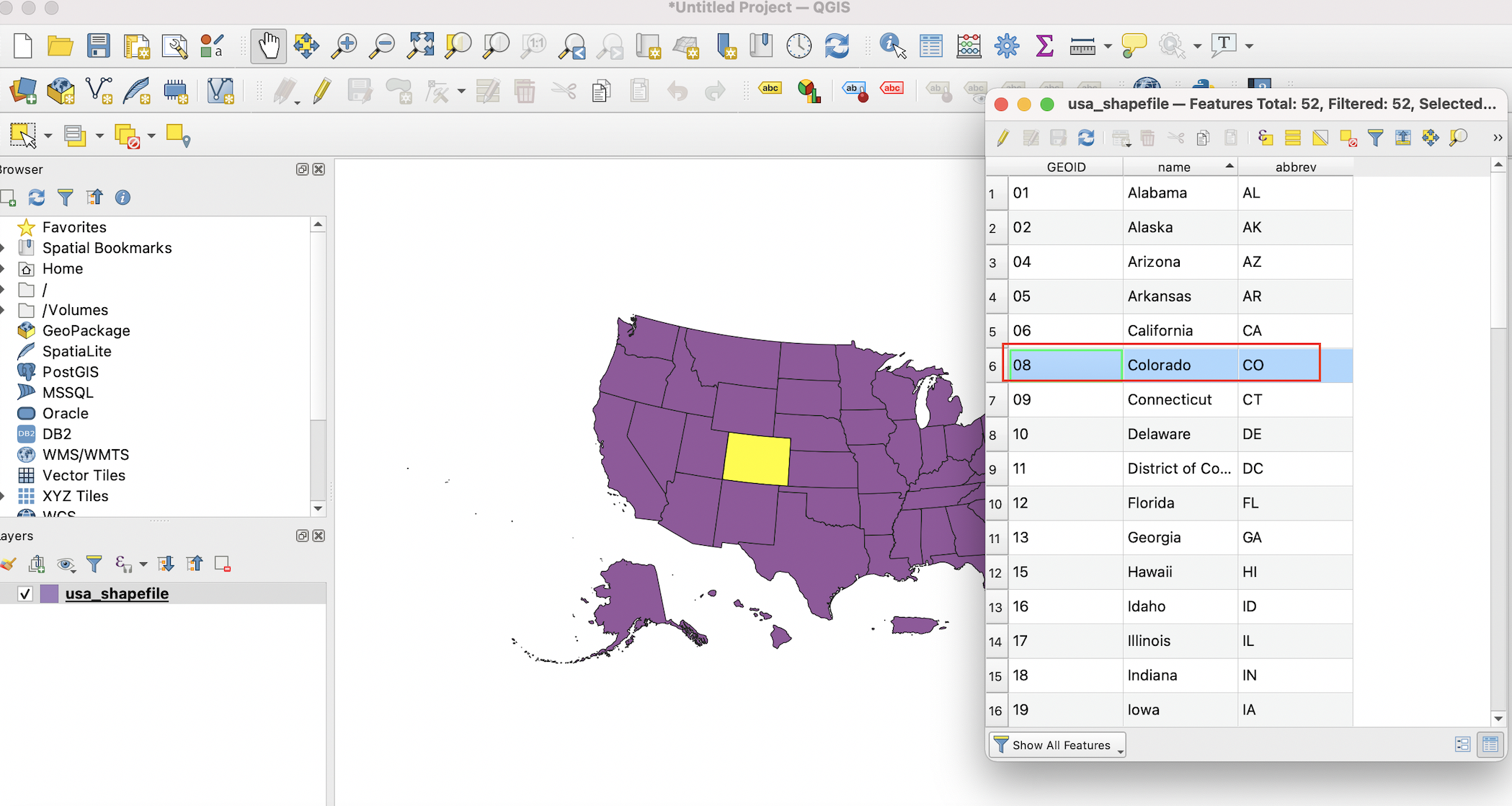
Figure 3.8: Select a record within the opened attribute table
If you want to deselect a selected record, click the Deselect all features from the layer button in the menu bar on top of the attribute table:
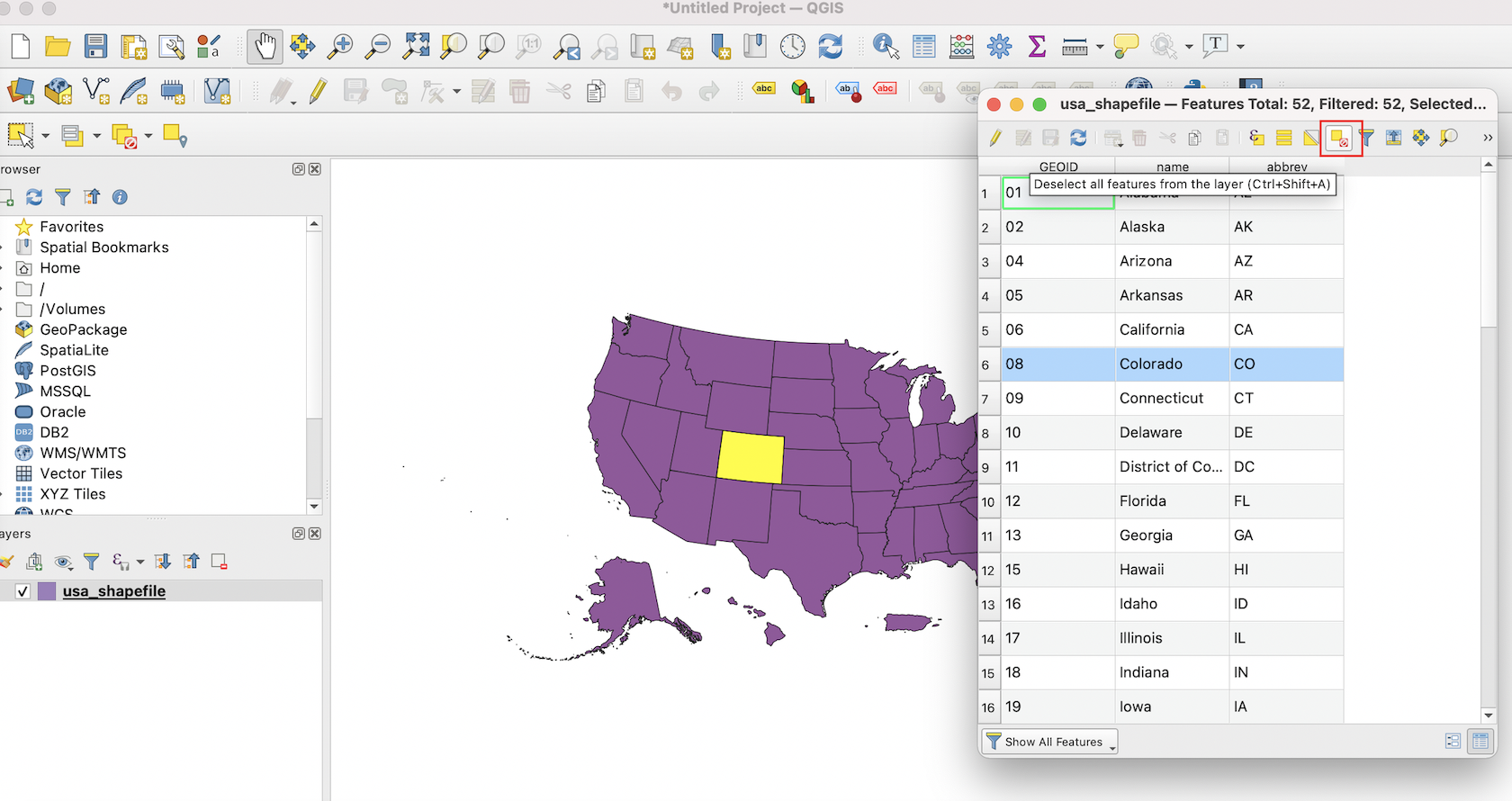
Figure 3.9: Deselect a selected record
3.3 Add tabular CSV data to QGIS
Having adding the shapefile to QGIS, let’s import the tabular dataset (stored as a CSV file) that contains information on partisan control over state governments, which is the data that we want to ultimately visualize on a map.
To add the CSV file, click the Layer menu from the QGIS menu bar, and then select Add Layer followed by Add Delimited Text Layer:
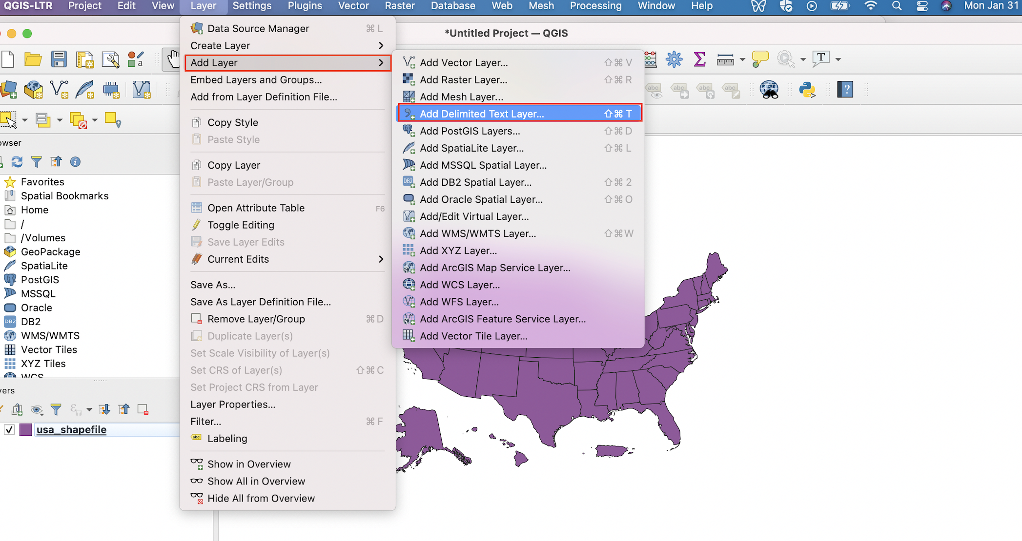
Figure 3.10: Navigate to menu that facilitates the importing of tabular data
Click on the ellipsis next to the File name bar, and then navigate to the CSV file on your computer and add it; at this point, the file path to the CSV will appear next to the File name bar. Under the File Format section, make sure that the CSV (comma separated values) button is selected. Finally, under the Geometry Definition section, select the No geometry (attribute table only) button. Once these selections are made, go ahead and click the Add button on the bottom of the dialog box.
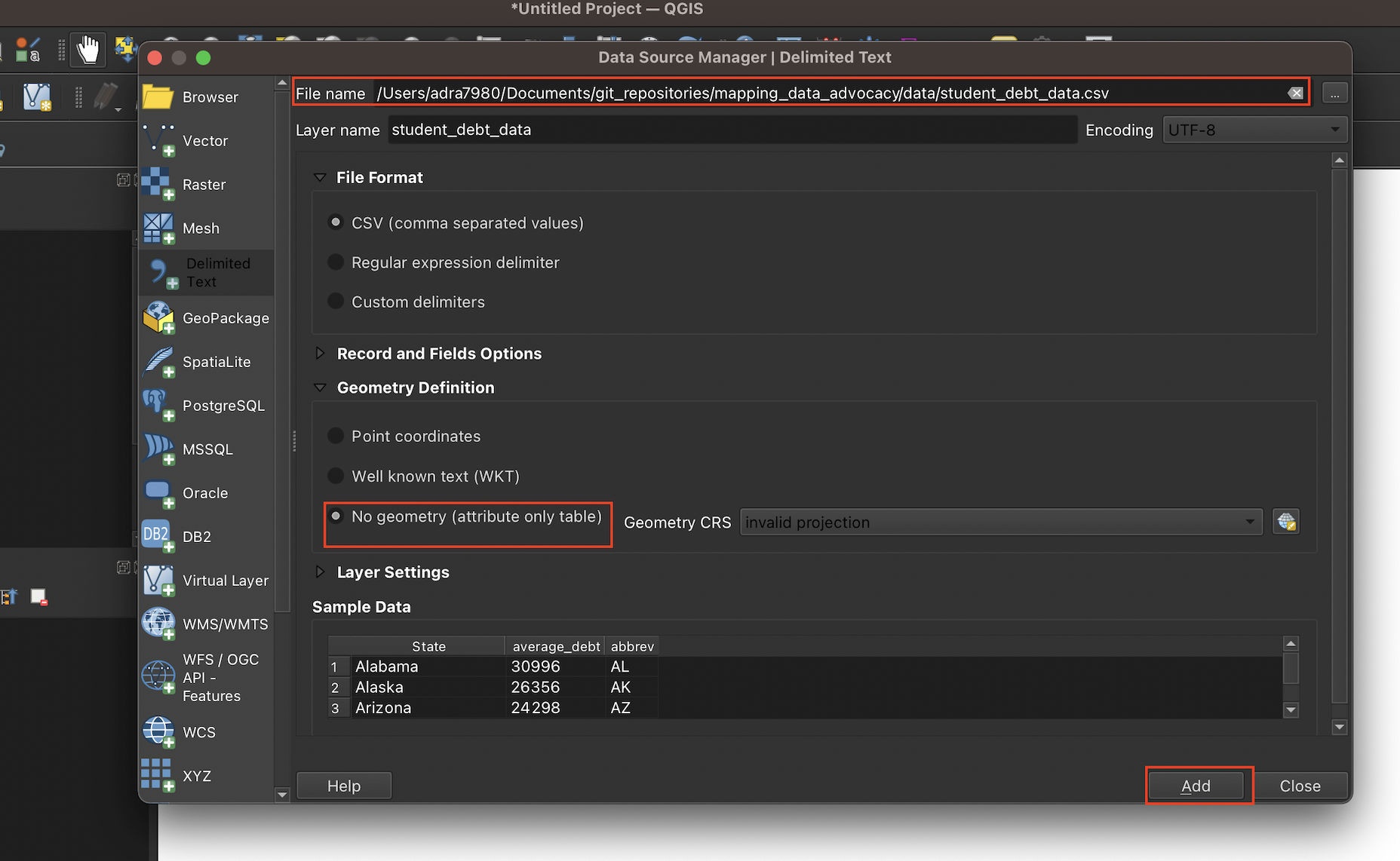
Figure 3.11: Set paremeters before adding the CSV file
At this point, you’ll notice the CSV file (named student_debt_data) added to the Layers section on the bottom-left of the QGIS interface (right above the shapefile). To inspect the CSV file, right-click on the file in the Layers menu, and select Open Attribute Table,
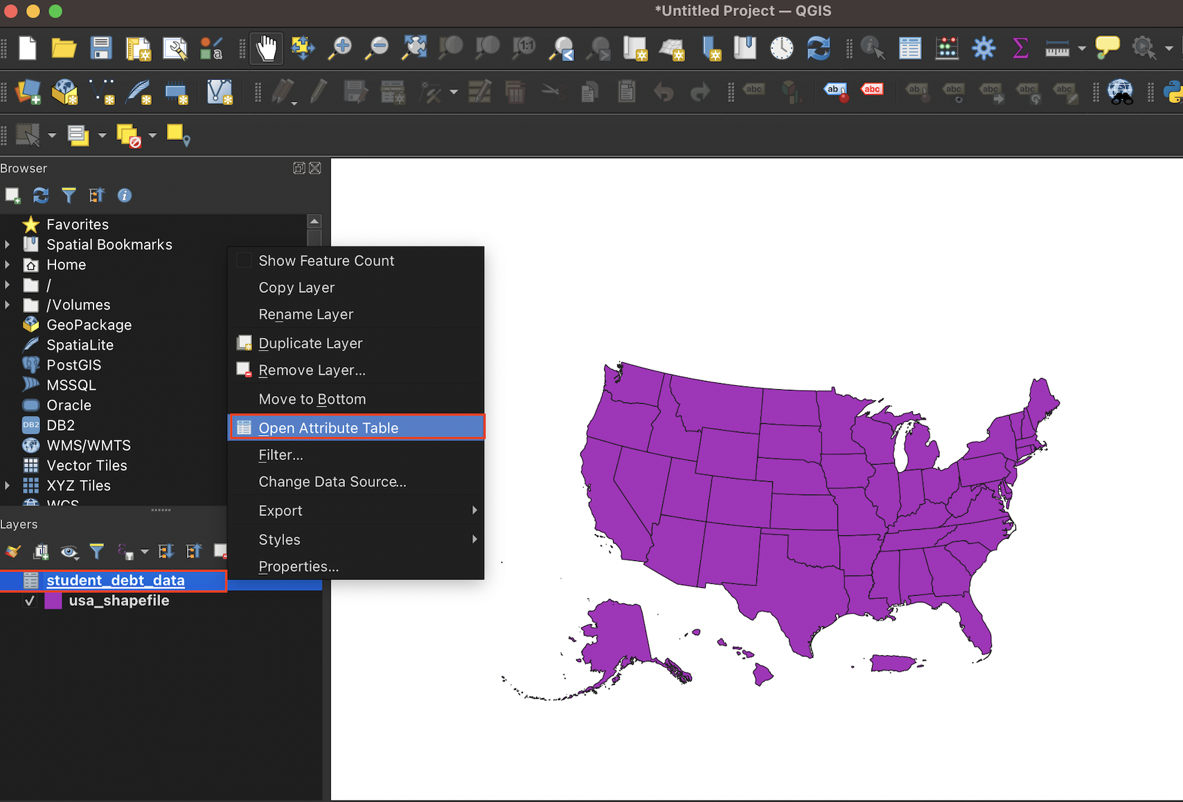
Figure 3.12: Open the CSV file within QGIS
The tabular dataset/CSV file, when opened up in QGIS, will look something like this:

Figure 3.13: The tabular dataset open within QGIS
3.4 Join the tabular data (student_debt_data) to the shapefile (usa_shapefile)
Now that we have both the shapefile of the United States and tabular CSV data in QGIS, let’s join the latter to the former so that we can display our data of interest on a map. To initiate the join, right-click the shapefile (usa_shapefile) in the Layers box, and select Properties.
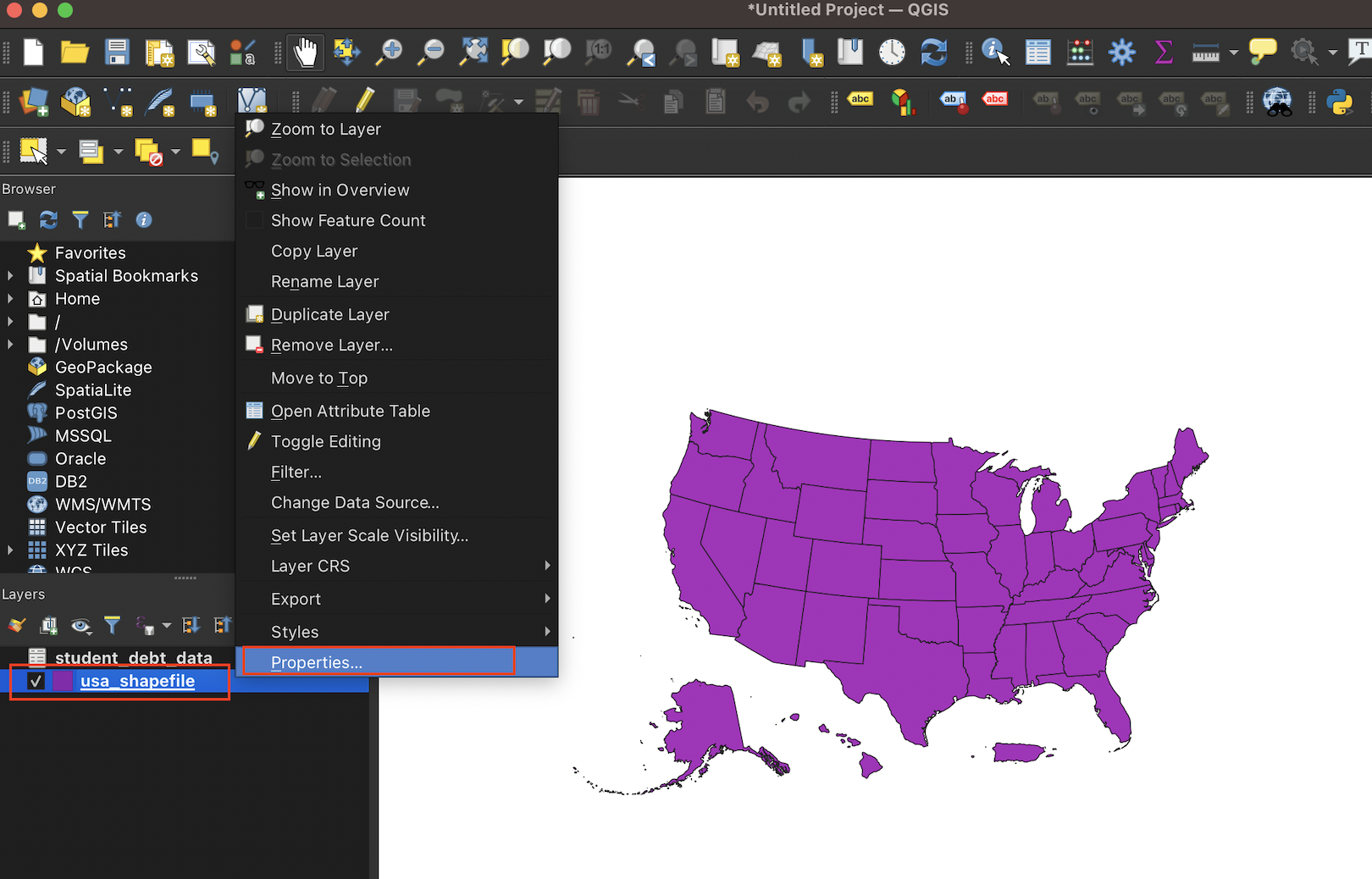
Figure 3.14: Open the ‘properties’ dialog box
Within the Layer Properties dialog box that opens up, select the Joins tab. Once the Joins tab is open, you’ll see a green + sign on the lower left. Go ahead and select it to open the Add Vector Join dialog box:
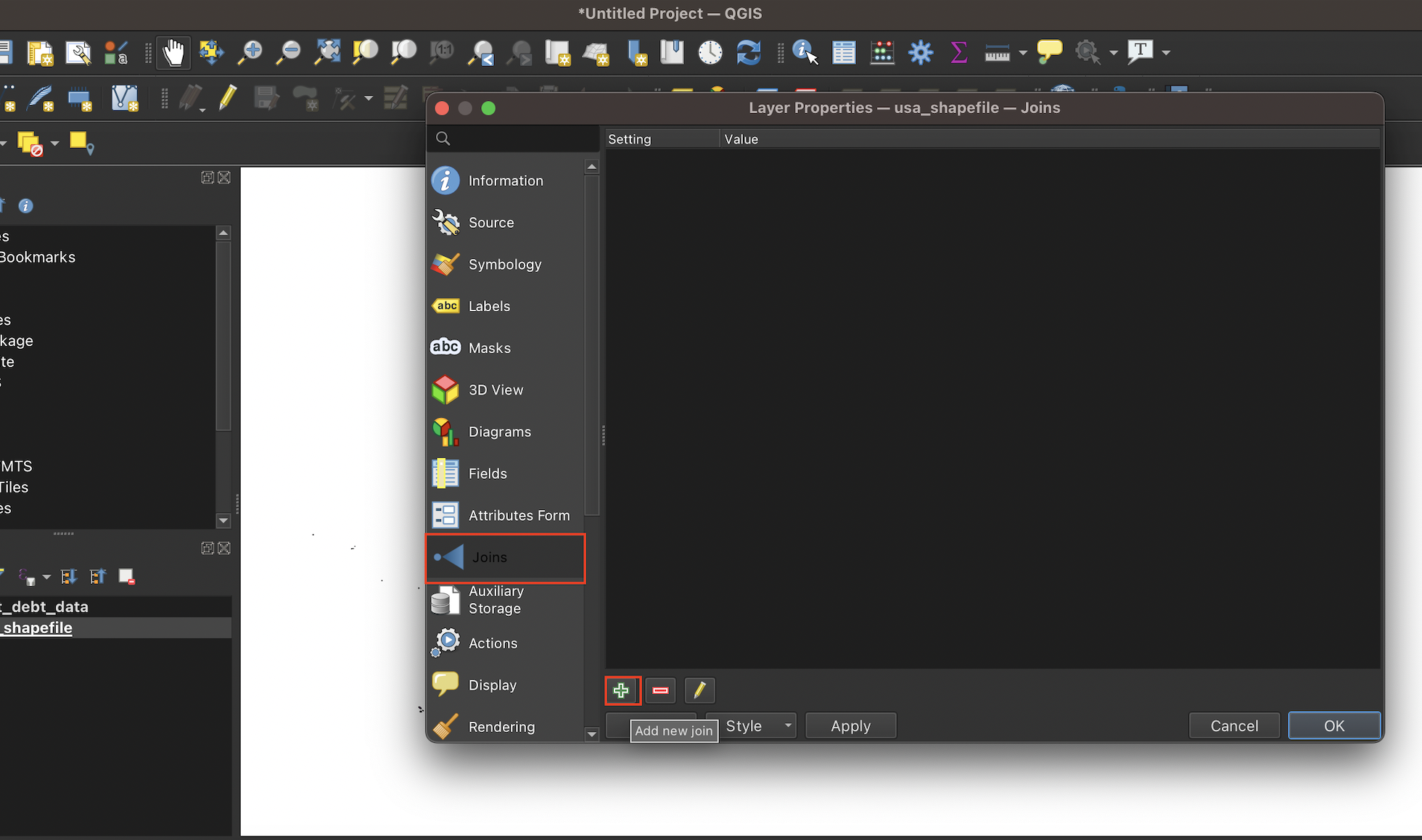
Figure 3.15: Initiating a join
Once the Add Vector Join dialog box is open, select the name of the CSV file within the Join layer dialog box. Select abbrev for both Join field and Target field, since the name of the variable we’re matching on is abbrev in both datasets (recall that the abbrev field contains two-letter state abbreviations). If, for example, the name of the field containing abbreviations was abbreviations in the shapefile, but abbrev in the CSV dataset, you would have selected abbreviations in Join field and abbrev in Target field.
After making these selections, go ahead and click OK to close the Add vector join dialog box:
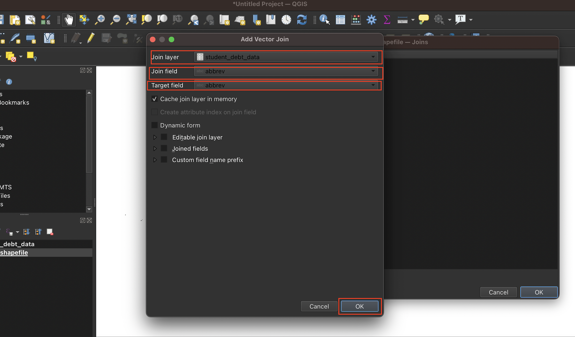
Figure 3.16: The ‘Add vector join’ dialog box
Then, finalize the join by clicking OK within the Layer Properties dialog box:

Figure 3.17: Finalize join
When you right-click the shapefile in the Layers box on the bottom-left and open up the attribute table, you’ll note that our data of interest from the CSV has been added to the shapefile:
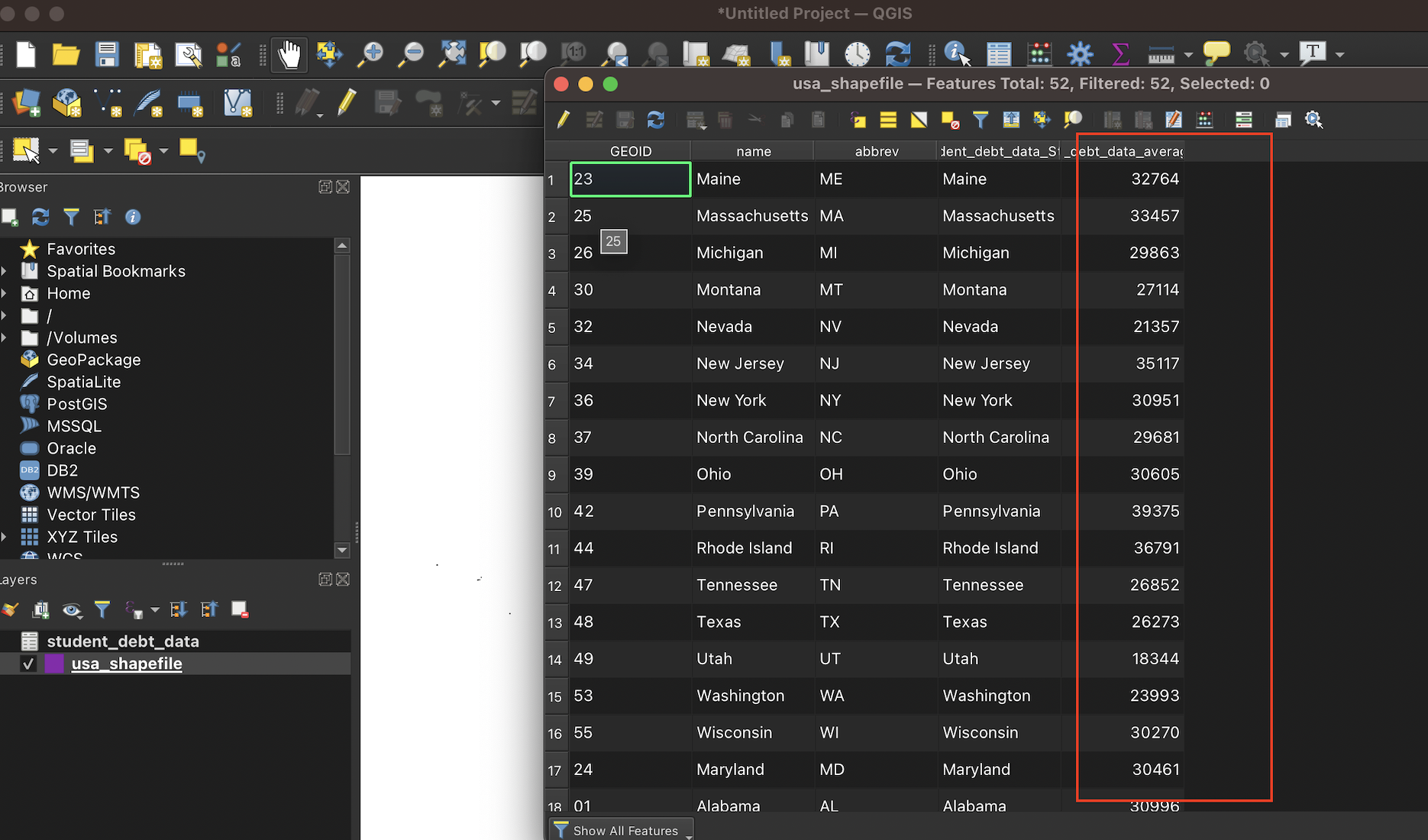
Figure 3.18: Shapefile’s attribute table after join
3.5 Display the student debt data on the shapefile
Now that the student debt data we would like to map is attached to the shapefile, let’s go ahead and map average student debt by state.
To do so, right-click the shapefile from the Layers box, and select Properties (just as you did to implement the join). This time, once the Layer Properties dialog box is open, select the Symbology tab:

Figure 3.19: Opening the Symbology tab from the Properties dialog box
On the top of the Symbology tab that opens up, you’ll note a drop-down menu; select Graduated since we’re working with continuous data.
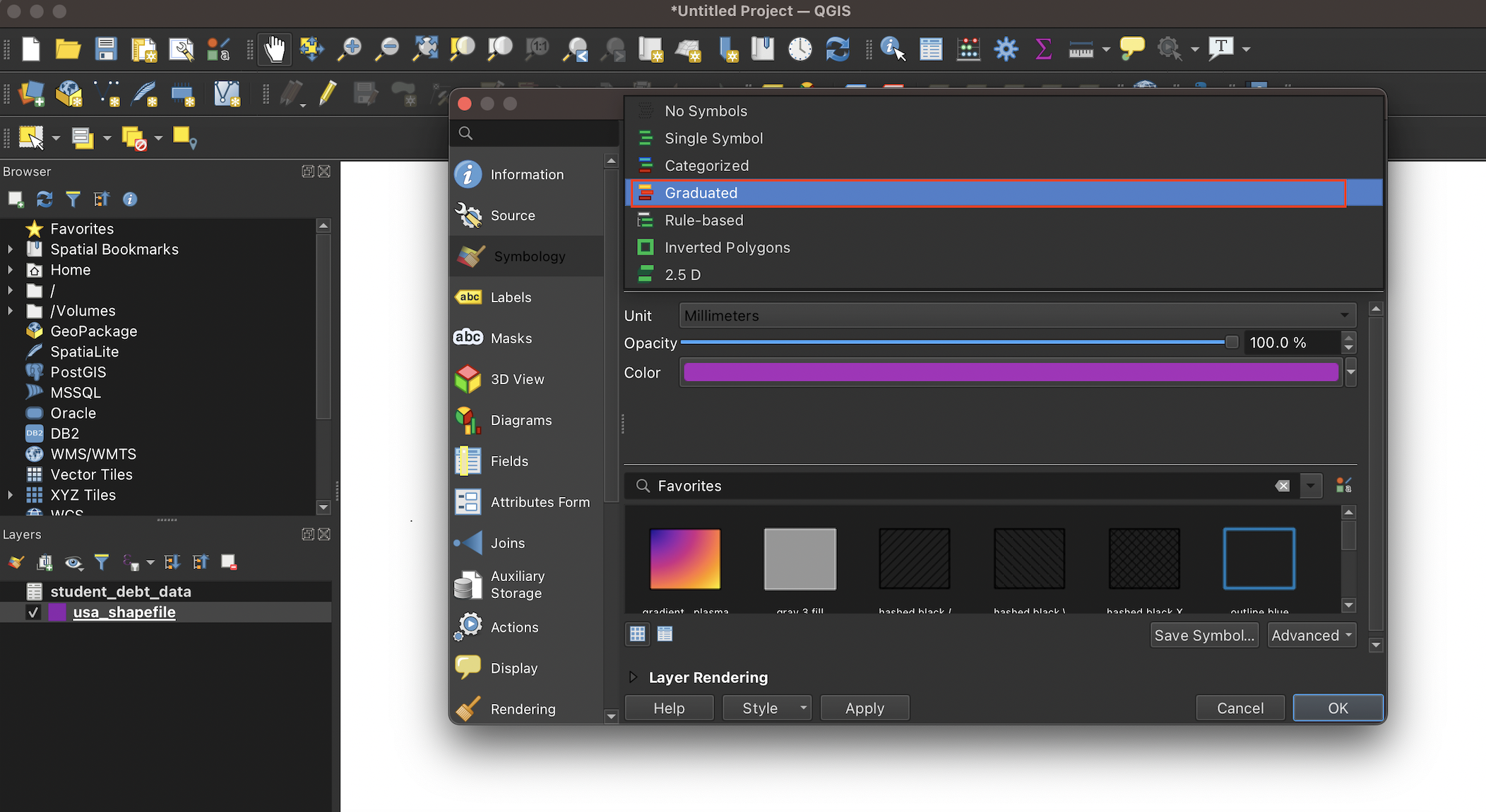
Figure 3.20: Select classification scheme from menu bar; here, ‘Graduated’
Next to the Value field, select student_debt_data_average_debt, which is the name of the field in the shapefile that we’d like to map:
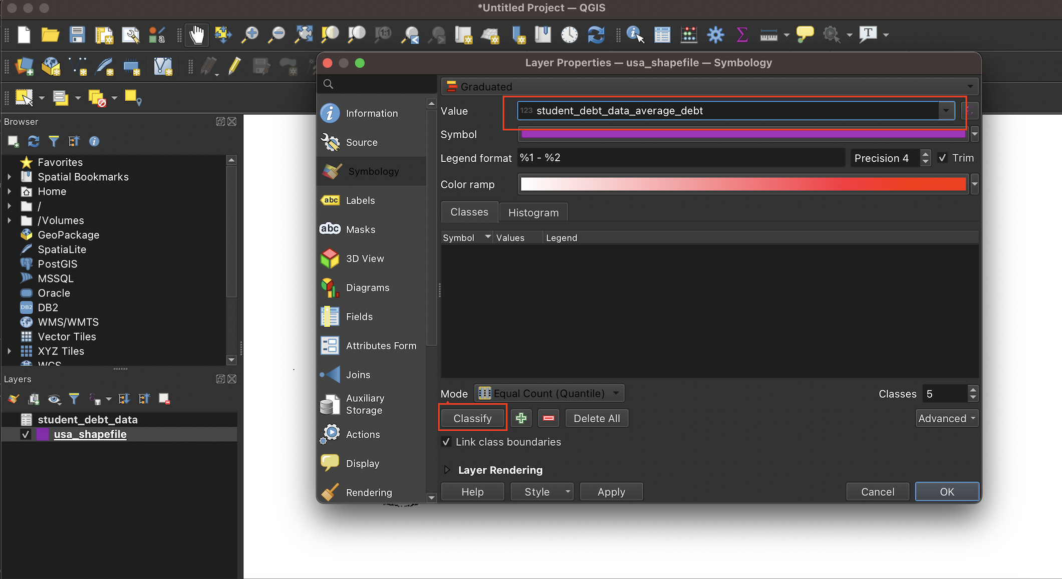
Figure 3.21: Select column containing values to be mapped from the ‘value’ drop-down menu
Once you do so, you’ll see that field’s data appear, with a default color scheme:
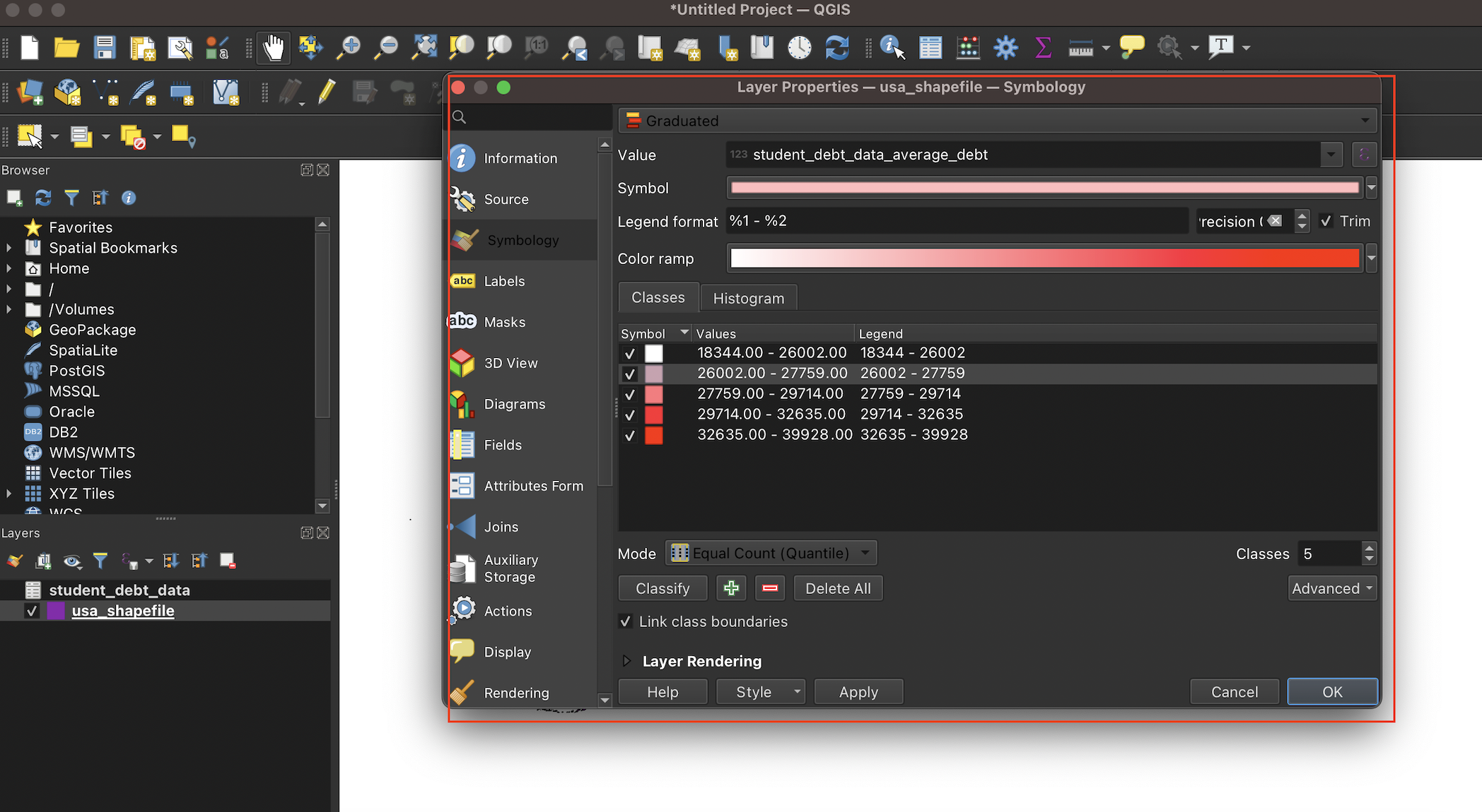
Figure 3.22: Default colors and data intervals
We will use the same color scheme and classification breaks as the map on the Institute for College Access and Success’s website. Change the color scheme and interval classifications on the symbology tab to match the ones below (don’t worry about making the colors match exactly). You can select colors by double-clicking the square color icons under the “Symbol” column; you can set interval breaks by double-clicking next to the square color symbols under the “Values” column and typing in the desired break; finally, you can specify how you want a given interval break represented on the map’s legend by double clicking next to the corresponding value (under the “Legend” column) and typing in the desired label:
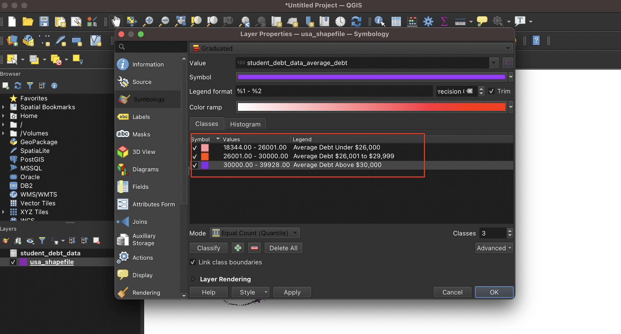
Figure 3.23: Set colors and intervals
Once you’ve made these selections, click Apply on the bottom-left of the dialog box, and then go ahead and click OK. At this point, our shapefile and the corresponding legend will look something like this:
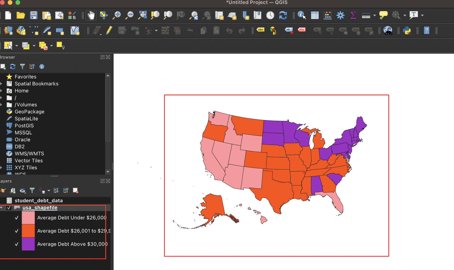
Figure 3.24: Map with changes applied
The data has been visualized on your shapefile!
3.6 Make a print map using the Print Layout interface
At this point, we can turn to the process of turning this shapefile into an exportable print map in QGIS. First, select Project from the topmost QGIS menu bar, and select New Print Layout.
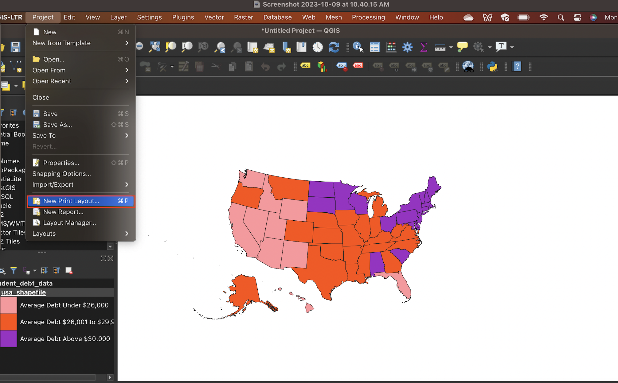
Figure 3.25: Open Print Layout
You will be prompted to give your print layout a descriptive name:

Figure 3.26: Give Print Layout a title
The Print Layout that opens will look something like the image below. To add the image of our shapefile to the print layout, click on the Add Item menu bar on top, and choose Add Map:
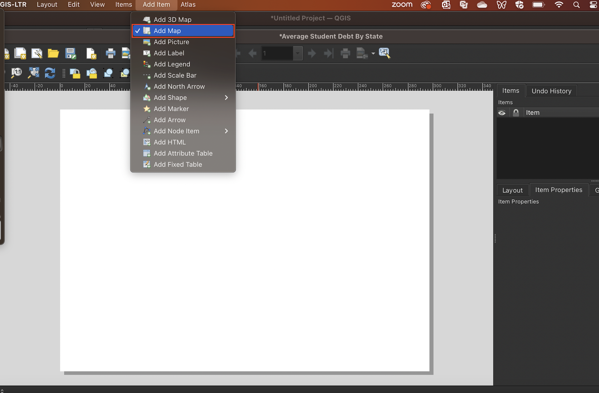
Figure 3.27: Click ‘Add Map’ from the ‘Add Item’ menu bar
After selecting Add Map, click on the top-left of the map canvas, and drag to the bottom-right:
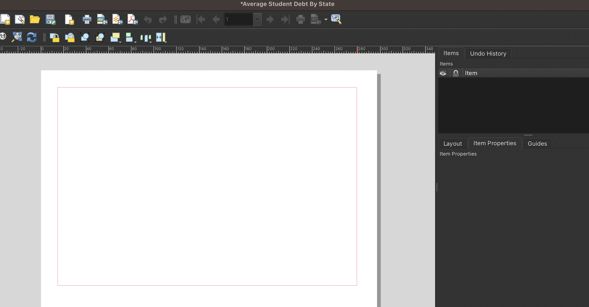
Figure 3.28: Click and drag across the map canvas
This will add an image to the print layout that is based on the shapefile that is open in the main QGIS project window:
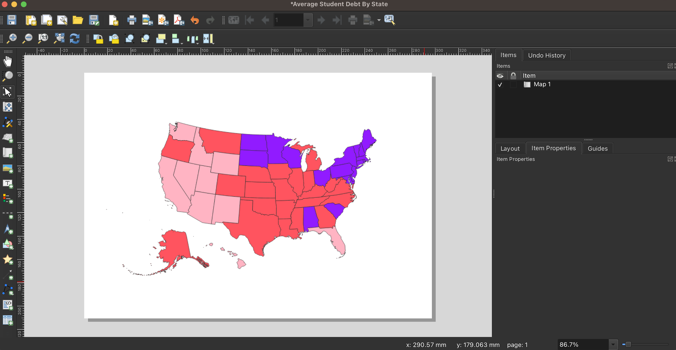
Figure 3.29: Shapefile imported into QGIS print layout as a map
To add a legend, click the Add Item menu from the print layout’s menu bar, and select Add Legend:
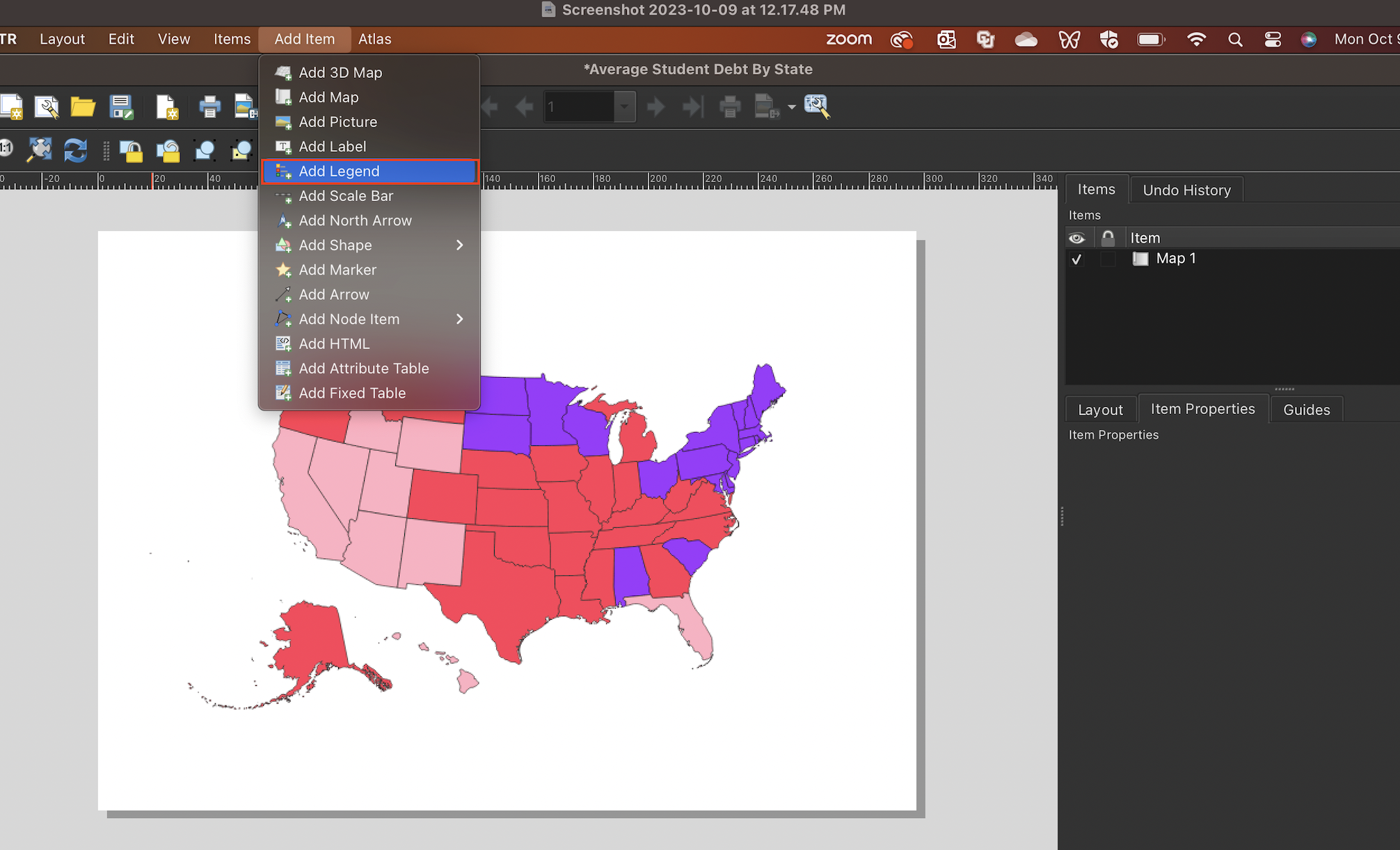
Figure 3.30: Add a legend from the ‘Add Item’ menu
Click and drag in approximately the area you’d like the legend to appear (but note that you can move anything added to the print layout by simply clicking and dragging). On the right, you’ll see a Legend Properties dialog box that will allow you to customize the initial appearance of the legend:
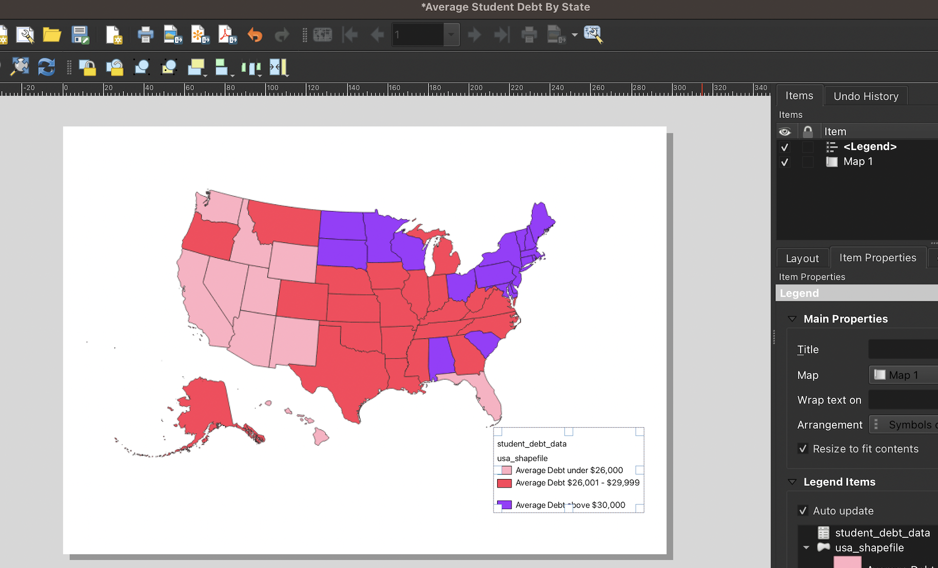
Figure 3.31: Legend’s initial appearance
Let’s make a few changes to the legend. We’ll remove the title and subtitles (i.e. “student_debt_data”, and “usa_shapefile”).
First, uncheck the Auto update button in the Legend Items section:
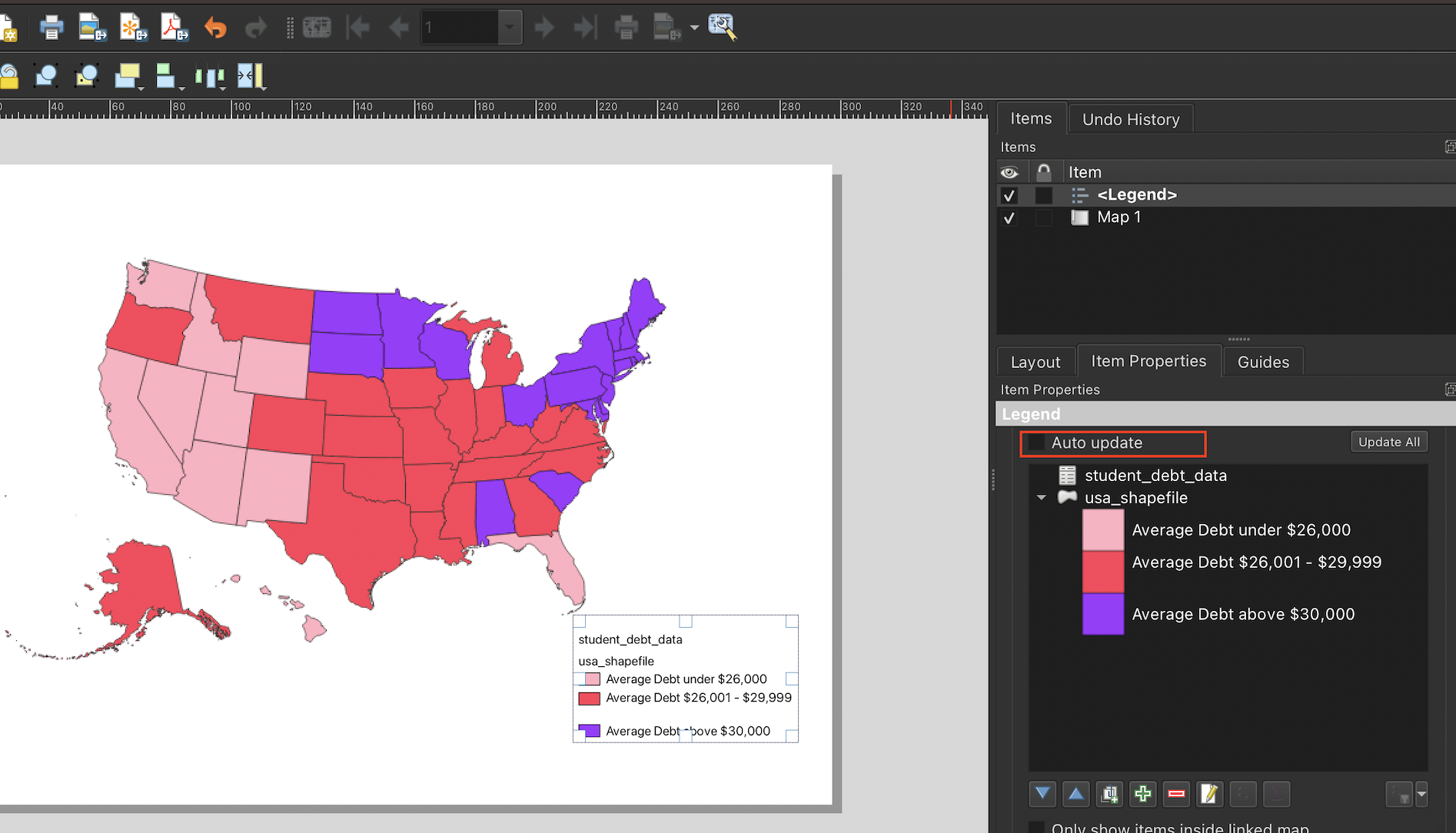
Figure 3.32: Uncheck the auto update button
Now, to remove the usa_shapefile label, right-click it in the Legend Properties dialog box, and click Hidden:
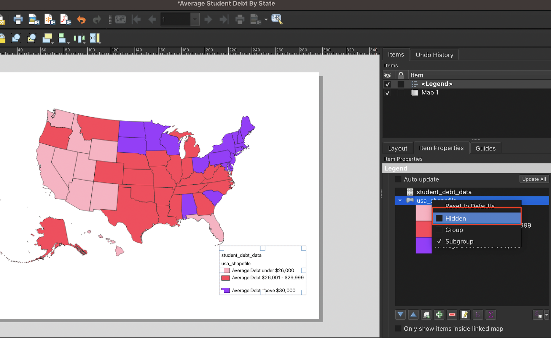
Figure 3.33: Remove superfluous legend label
Repeat this process for the usa_trifecta_data title.
To increase the size or font of the legend text, first scroll down in the Legend Properties dialog box to the Fonts and Text Formatting section:
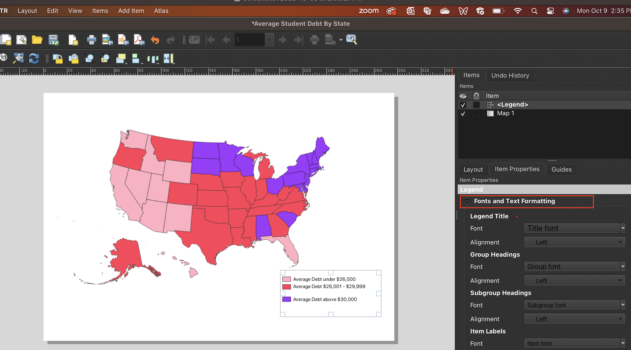
Figure 3.34: Scroll to legend dialog box’s ‘Font’ section
Here, you can adjust the font and appearance of your legend items. To illustrate, let’s make the text of our legend slightly larger than it is now. We’ll scroll down to the “Item Labels” subsection, and double-click the font bar:
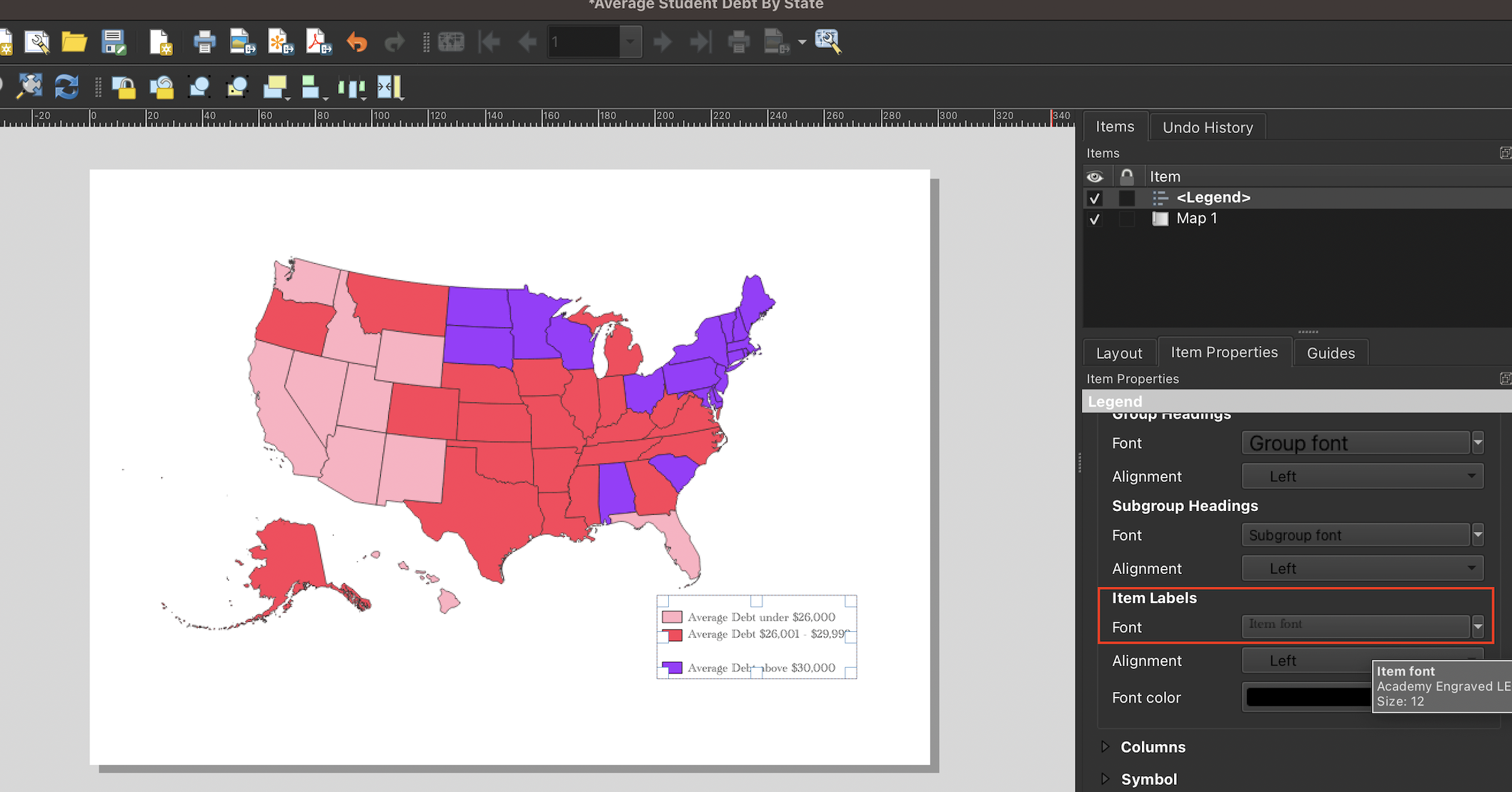
Figure 3.35: Click on the ‘Font’ button under the ‘Item Labels’ heading
A Text Format dialog box will then open up, allowing you to customize the legend’s font and other aspects of its appearance. We’ll increase the size of the text to 14:
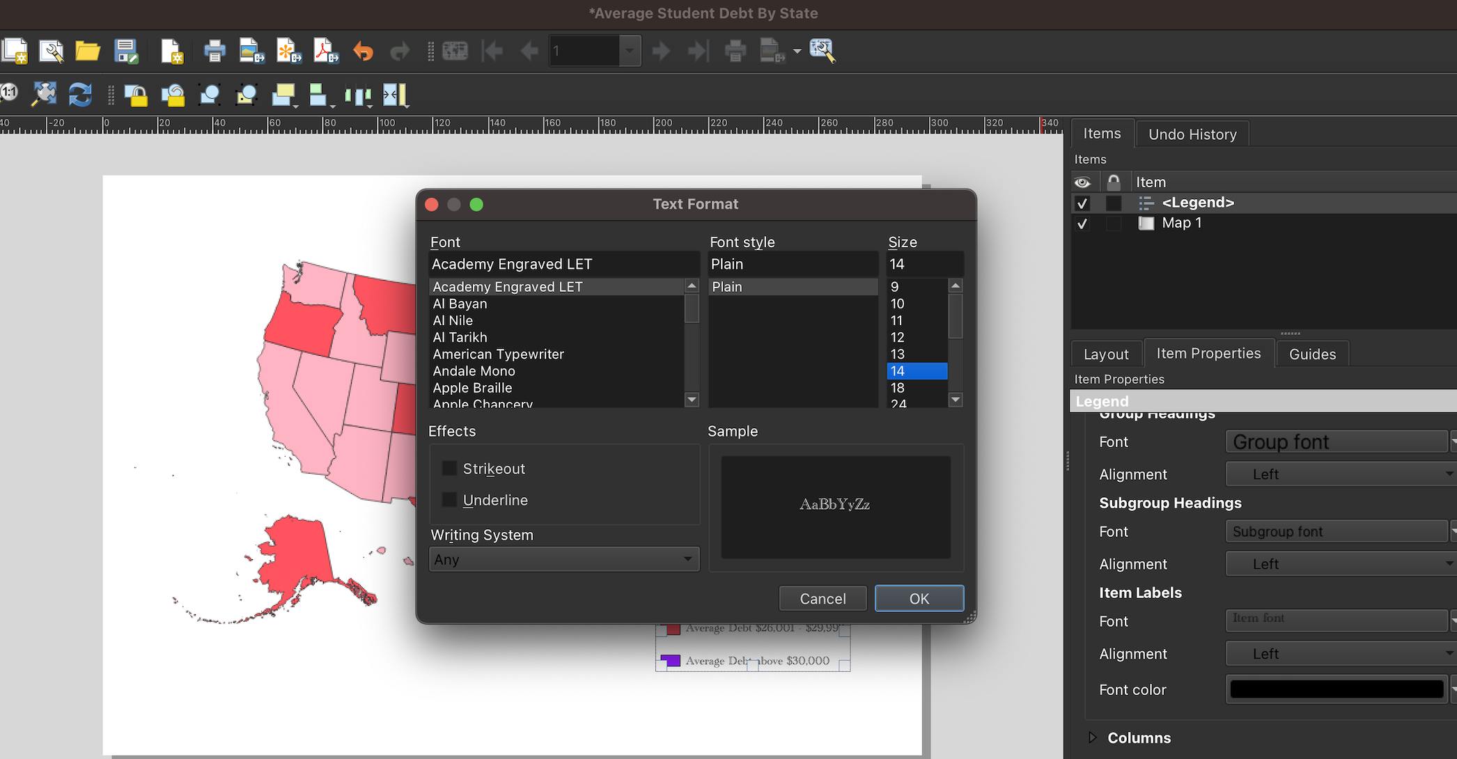
Figure 3.36: Set legend font preferences
To add a map title (or any other text) to your map, select the Add Item menu, and click Add Label:
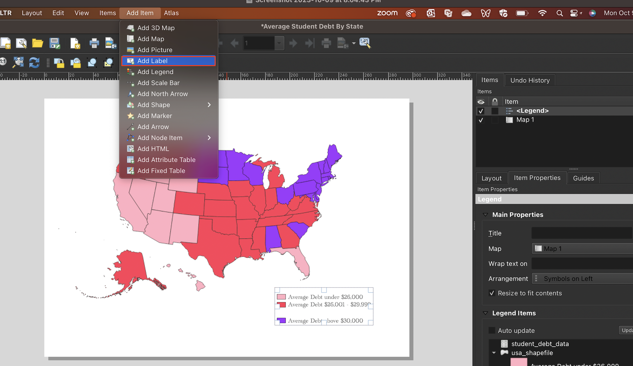
Figure 3.37: Click ‘Add Label’ from the ‘Add Item’ menu
Click and drag to create a text box. You can alter the text within the text box in the Label Properties dialog box that opens to the right:
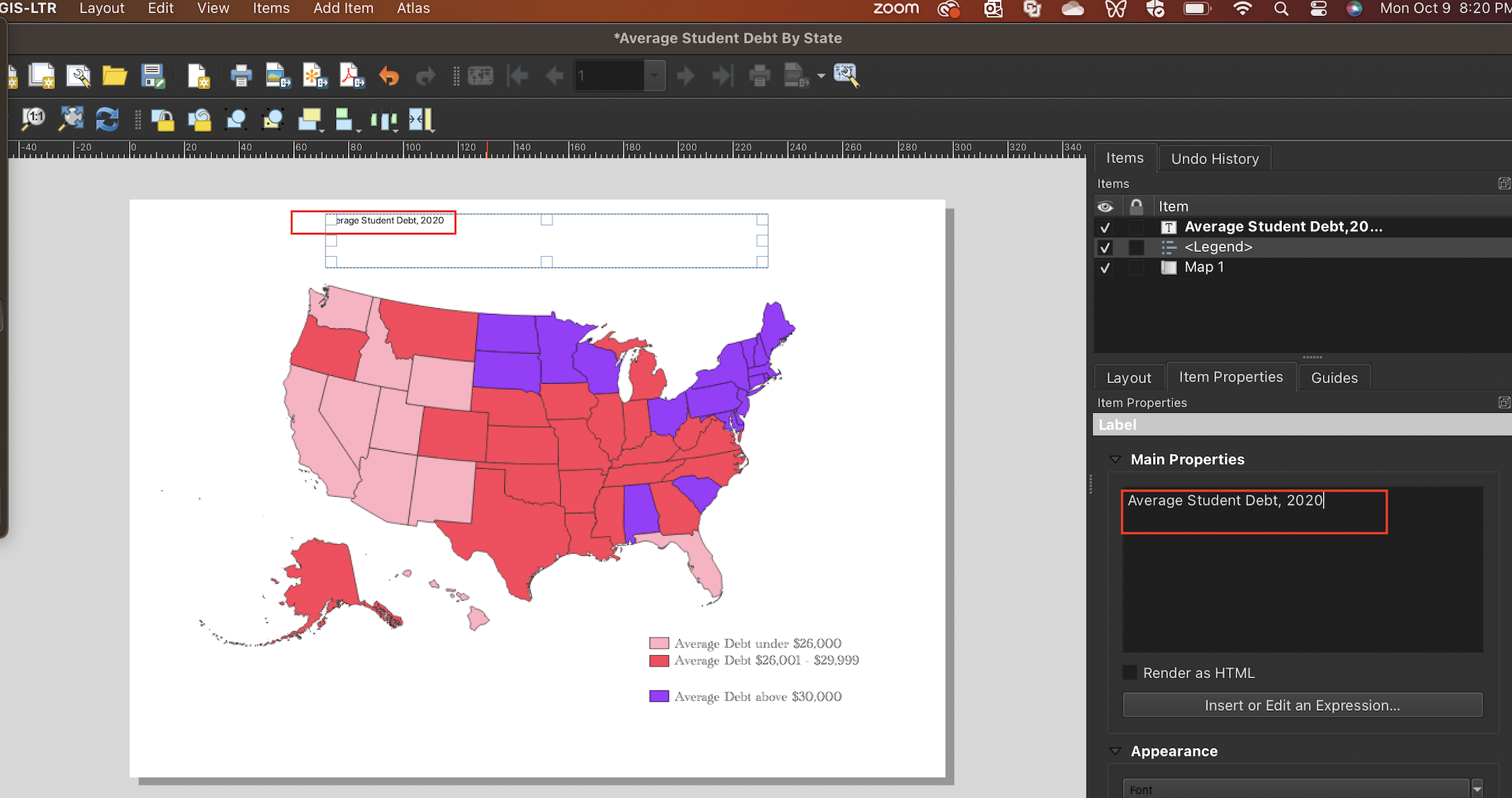
Figure 3.38: Print the text for the title in the ‘Main Properties’ dialog box associated with the label
You can alter the title’s font and size by clicking the Font drag-down menu that lies right below the Appearance label. This will open up the Text Format dialog box, which allows you to customize your text’s appearance. Here, we’ll increase the size of our title to 18, and change the font to Arial; we’ll also make the title bold.
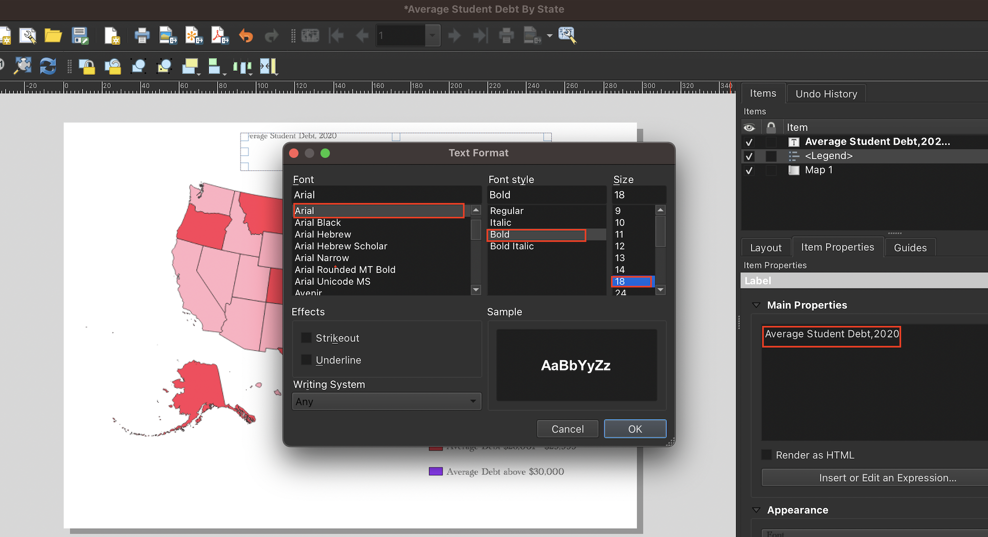
Figure 3.39: Customize the title’s font and size
You can add and customize a map credits section using the same process (i.e. add and customize another label)
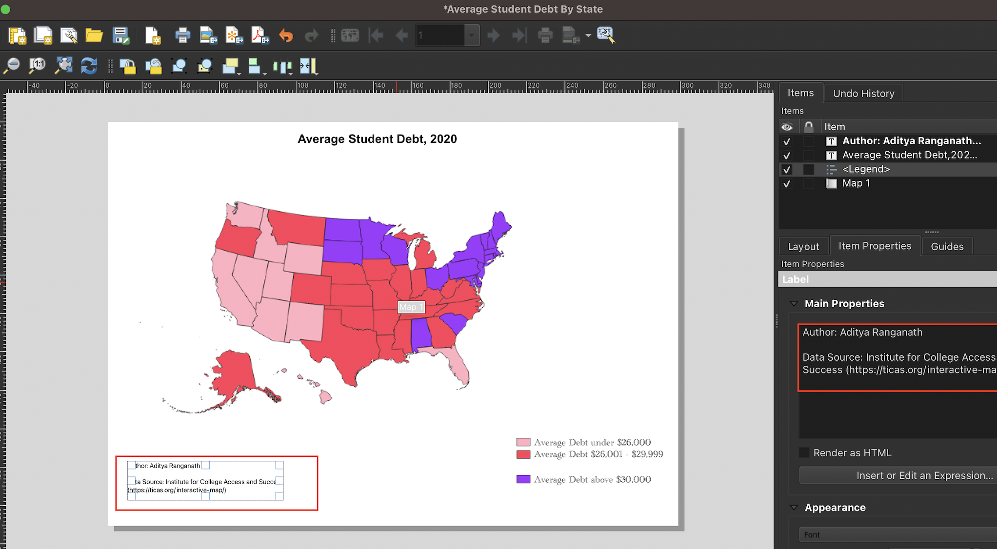
Figure 3.40: Add map credits
3.7 Export the completed map from QGIS
Once the map is satisfactory, you can export it by selected Layout from the QGIS menu, and selecting the option to export either as an image, SVG, or PDF file. Once you follow the subsequent prompts, the map will be written to your disk in the location you specify:
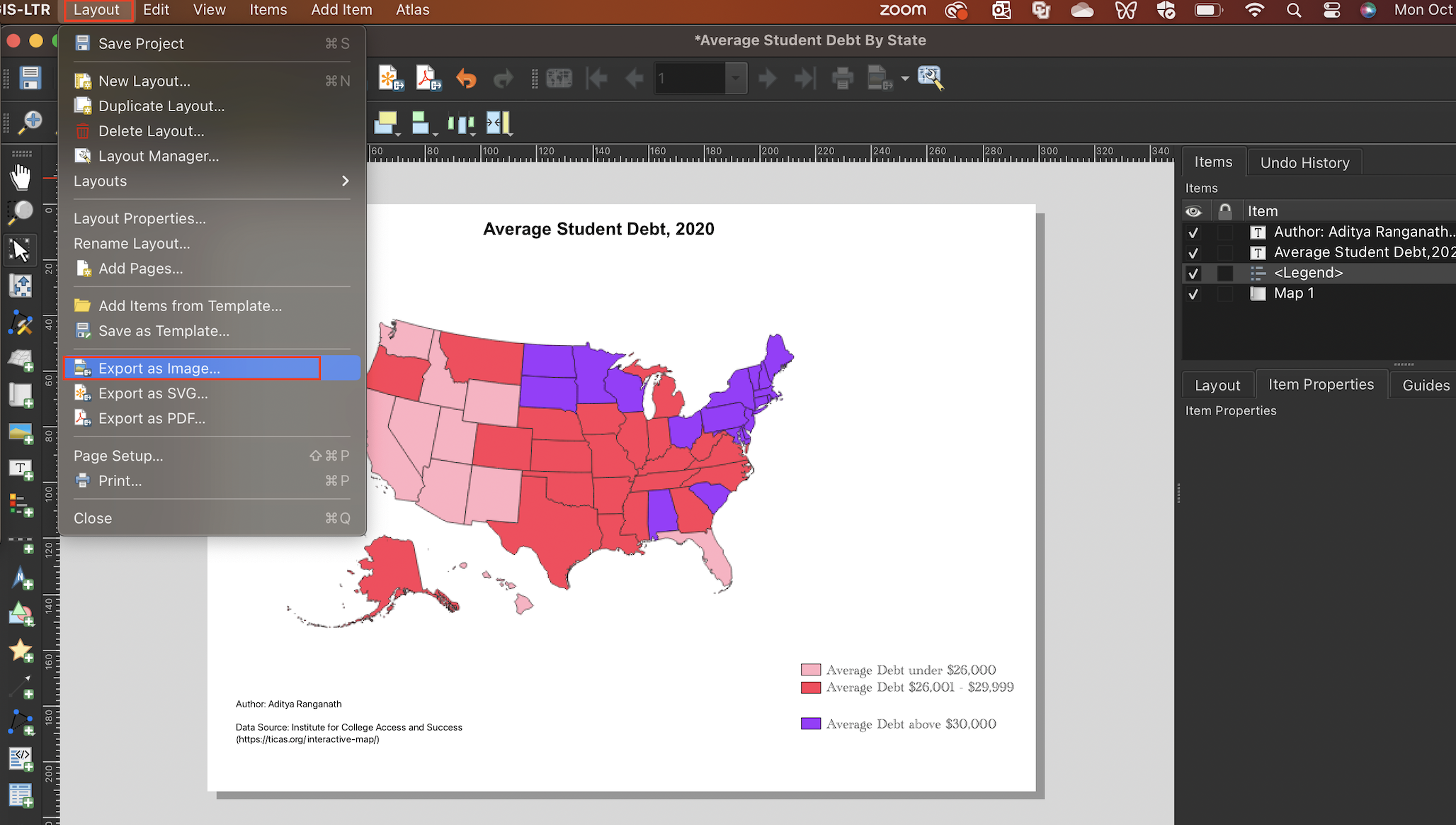
Figure 3.41: Exporting a completed map from QGIS
Once you’ve exported the map, open it up and ensure that everything looks in order:
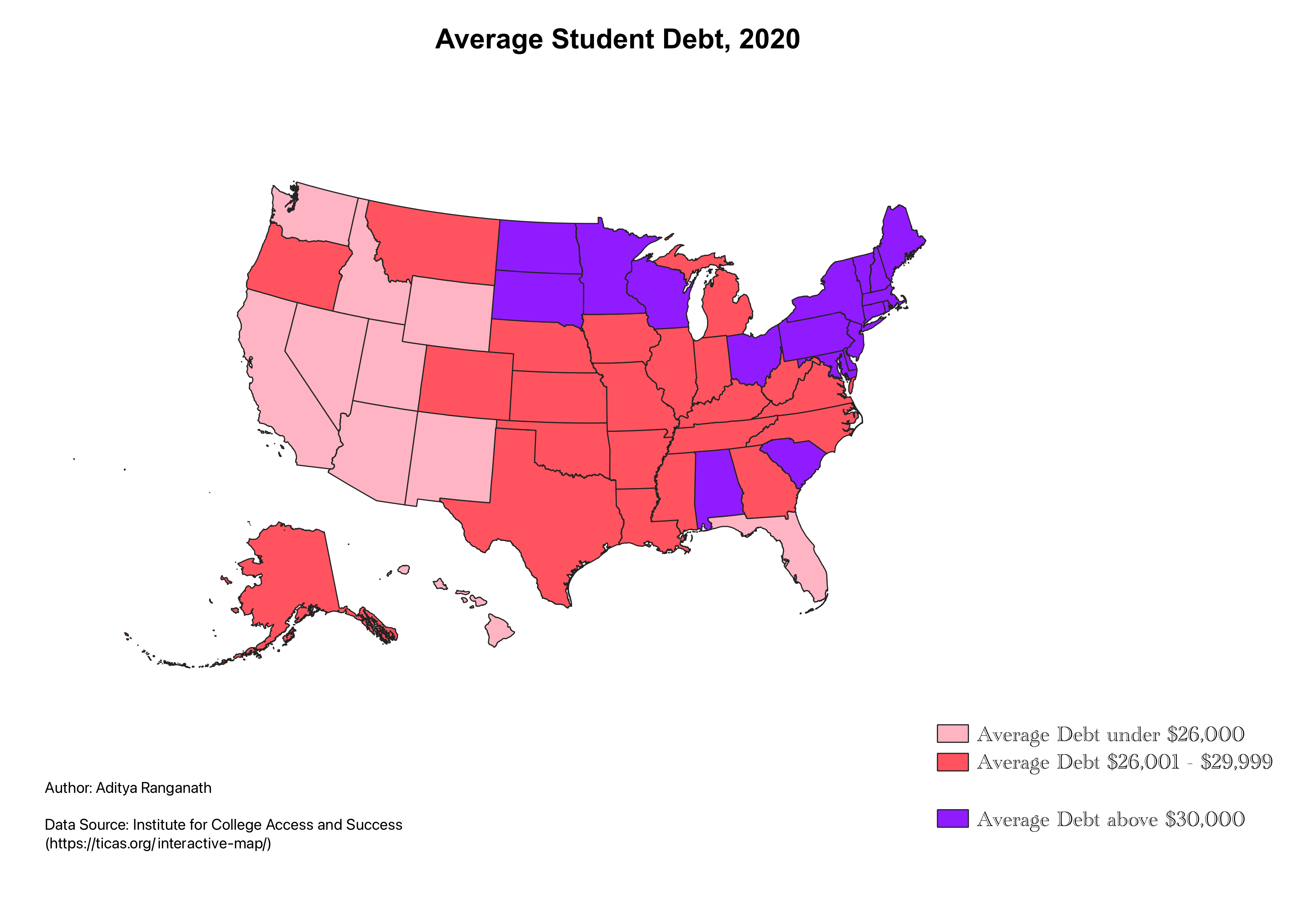
Figure 3.42: The map exported from QGIS as a png file