Shiny Data Applications
Last updated on 2025-12-30 | Edit this page
Estimated time: 12 minutes
Overview
Questions
- How do you create Shiny applications that allow users to query and explore datasets in an intuitive and interactive manner?
Objectives
- Apply what you learned about general principles of Shiny application development in the previous Episode to make simple but powerful Shiny applications that facilitate interactive data exploration
- Continue to learn new tools, concepts, and functions related to Shiny application development
Preliminaries
Before beginning this episode, please ensure you have the following libraries installed and loaded:
R
library(shiny)
library(shinyjs)
library(nycflights13)
library(tidyverse)
library(DT)
library(shinythemes)
Introduction
Now that we are oriented to some of the fundamental principles of application development in Shiny, we’ll use what we learned to develop simple applications that can facilitate interactive and intuitive data exploration. By showcasing how Shiny applications can function as interactive portals into static datasets, this Episode aims to stimulate ideas about how you might use Shiny to make your own datasets more broadly accessible to non-specialist audiences.
This Episode uses a “case-study” approach to demonstrating how the basic principles we learned in the previous Episode can be applied in the context of developing dataset-based applications. Certain new features of Shiny will be introduced as we go, but for the most part, the focus will be on applying and reinforcing what we have already learned about Shiny, but in an applied context that is more relevant for researchers and data scientists than application developers.
Shiny script template
Before proceeding to our first data application, we’ll briefly introduce R Studio’s Shiny template, which you can use to develop the applications in this Episode. In the previous Episode, we wrote out our simple Shiny applications in regular R scripts. Writing Shiny code from scratch offered good practice when starting out, but it’s useful to know that R Studio comes with a prebuilt shiny template that can make it easier to develop applications. This template is actually a simple Shiny app, and we can swap out the elements in this template with our own as we go; this allows us to focus on our inputs and outputs, rather than the app’s structure. To access this template go to File, then select New File followed by Shiny Web App:
This will open up a small dialog box in which you’re asked to name the application and specify a directory; R Studio will create a new sub-directory within the specified directory with the name you provide. This sub-directory can be used to house all of your application materials. R Studio automatically deposits a file within this sub-directory called app.R, which is the template. The template will also automatically be opened within R Studio after you close the dialog box. It looks something like this:
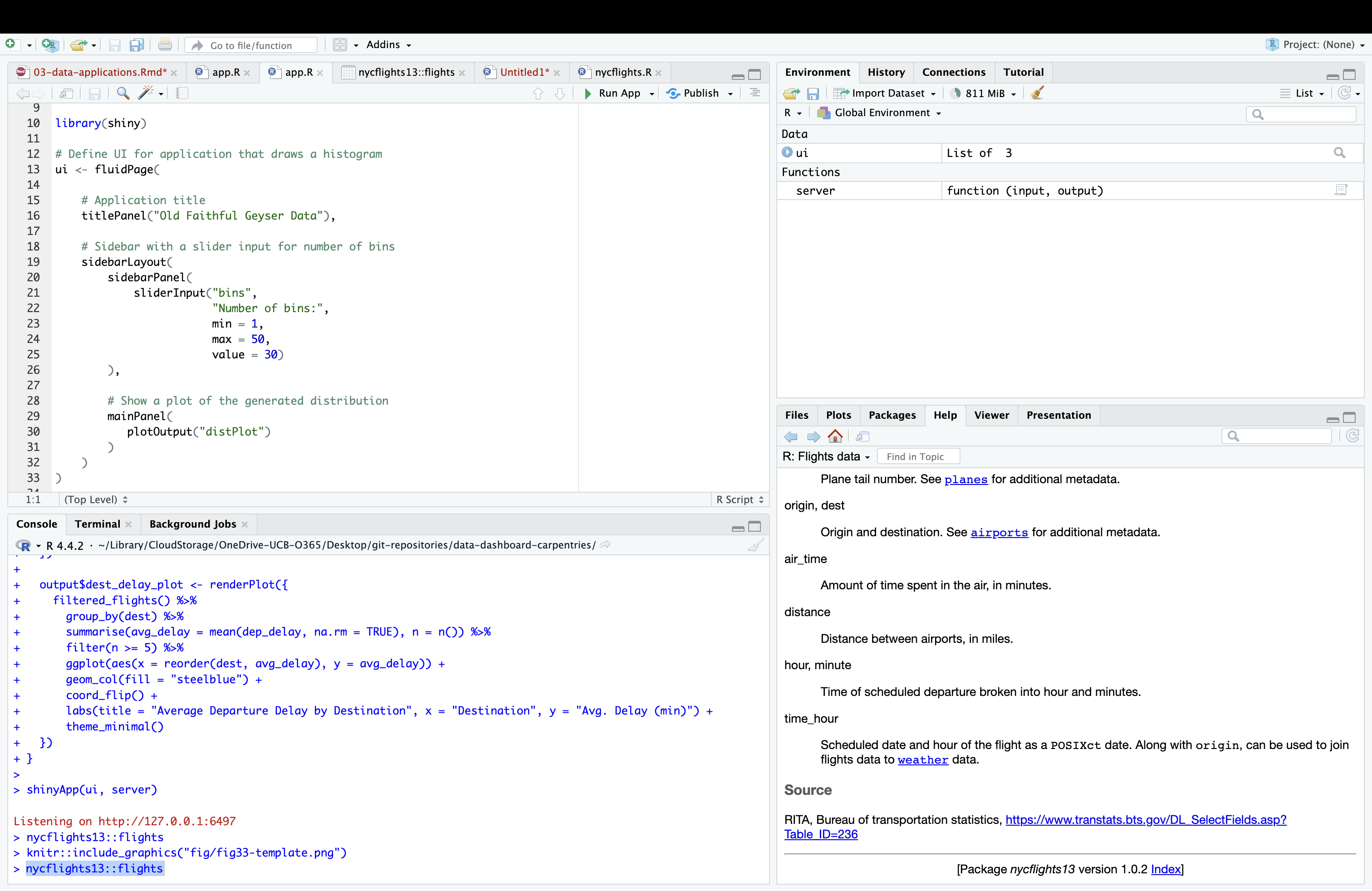
The template actually provides the script for a simple Shiny application, which you can launch by highlighting the script and clicking the Run App button in the menu bar right about the script. You can develop your own original applications by swapping in (and/or adding) your own title and application elements (inputs, outputs etc.) as you go. Using this template allows you to focus on these application elements, instead of worrying about writing the broader skeletal structure of the app from scratch.
Our first data application: querying flight delays
In your previous work learning about data analysis in R, you may have encountered a dataset of flight departures from New York City airports in 2013 from the nycflights13 dataset:
R
# prints flights dataset
nycflights13::flights
OUTPUT
# A tibble: 336,776 × 19
    year month   day dep_time sched_dep_time dep_delay arr_time sched_arr_time
   <int> <int> <int>    <int>          <int>     <dbl>    <int>          <int>
 1  2013     1     1      517            515         2      830            819
 2  2013     1     1      533            529         4      850            830
 3  2013     1     1      542            540         2      923            850
 4  2013     1     1      544            545        -1     1004           1022
 5  2013     1     1      554            600        -6      812            837
 6  2013     1     1      554            558        -4      740            728
 7  2013     1     1      555            600        -5      913            854
 8  2013     1     1      557            600        -3      709            723
 9  2013     1     1      557            600        -3      838            846
10  2013     1     1      558            600        -2      753            745
# ℹ 336,766 more rows
# ℹ 11 more variables: arr_delay <dbl>, carrier <chr>, flight <int>,
#   tailnum <chr>, origin <chr>, dest <chr>, air_time <dbl>, distance <dbl>,
#   hour <dbl>, minute <dbl>, time_hour <dttm>
This dataset is intuitive, interesting, and possibly familiar from your previous education in R. It theerfore offers a good opportunity to develop our very first data based application. Imagine you are a transportation analyst who has been tasked with developing a simple application that allows end users to specify a month and date, and view a table containing information about the five flights with the longest departure delays on that day, along with a plot that allows them to visualize these delays. Such an application could be useful to a senior-level decisionmaker that may not necessarily have data science expertise, but needs to quickly query the dataset to get a sense of day-by-day delay patterns. It could also be useful on a public-facing website.
Before starting to write your app (with the aid of the prebuilt Shiny template), it can be useful to consider briefly outline the app in plain language, which can subsequently help you to write out the code.
- The app will have a table and a plot as outputs, so we will need to
reserve space in the UI for these elements using output placeholder
functions. Recall from the previous episode that the placeholder
function for plots is
plotOutput(). We didn’t work with data tables in the previous episode, but Shiny’s native data table output function istableOutput(). However, Shiny’s native table functions are somewhat limited; they are static, when it is frequently the case that dynamic tables (which allow for scrolling) are preferable. The DT package has table functions that can be used in Shiny, and which support tables that have more functionality and which are aesthetically more appealing than native Shiny tables. As a result, we’ll use these DT functions in our app. The relevant table output placeholder function from DT isdataTableOutput(). - These placeholder functions will need to be accompanied by
corresponding output render functions in the server; these render
functions contain the code necessary to create the outputs that will
populate the UI. Our plot will be created within the
renderPlot()function, which we used in the previous episode. The DT package’s render function, used in conjunction withdataTableOutput()isrenderDataTable(). - We will use the
selectInput()function in the UI to create a drop-down menu where users can select the day and month of interest. - Turning to the server logic, it makes sense to create a reactive
expression that extracts all of the records associated with the user’s
desired month and day, and feed this information into the render
functions, where the records with the five highest delays can be
subsetted using dplyr’s
slice_head()function. In therenderPlot()function, this information will be used to make a plot (in ggplot2) of the five longest delays for that month/day.
Now, let’s translate this into Shiny code by populating the template with these functions and the relevant server logic:
R
ui <- fluidPage(
  titlePanel("Top 5 Departure Delays"),
  sidebarLayout(
    sidebarPanel(
      selectInput(inputId = "month", label = "Select Month", choices = 1:12, selected = 1),
      selectInput(inputId = "day", label = "Select Day", choices = 1:31, selected = 1)
    ),
    mainPanel(
      DT::dataTableOutput(outputId = "delay_table"),
      plotOutput(outputId = "delay_plot")
    )
  )
)

server <- function(input, output) {

  # reactive expression to extract records associated with the month/day desired by the user
  daily_flights <- reactive({
    flights %>%
      filter(month == input$month, day == input$day) %>%
      filter(!is.na(dep_delay))
  })

  # code to create table of the flights with the five longest delays on the user-specified day;
  # populates "dataTableOutput" in the UI
  output$delay_table <- DT::renderDataTable({
    daily_flights() %>%
      arrange(desc(dep_delay)) %>%
      slice_head(n = 5) %>%
      select(dep_time, sched_dep_time, dep_delay, carrier, flight, dest)
  }, options = list(pageLength = 5, scrollX = TRUE)) # specifies behavior and appearance of table

  # creates inverted bar plot of flights with the five longest delays on the user-specified day
  output$delay_plot <- renderPlot({
    top5 <- daily_flights() %>%
      arrange(desc(dep_delay)) %>%
      slice_head(n = 5)

    ggplot(top5, aes(x = reorder(paste(carrier, flight), dep_delay), y = dep_delay)) +
      geom_col(fill = "darkorange") +
      coord_flip() +
      labs(title = "Top 5 Departure Delays", x = "Flight", y = "Delay (min)") +
      theme_minimal()
  })
}

shinyApp(ui, server)
When you launch the app, it will look something like this:
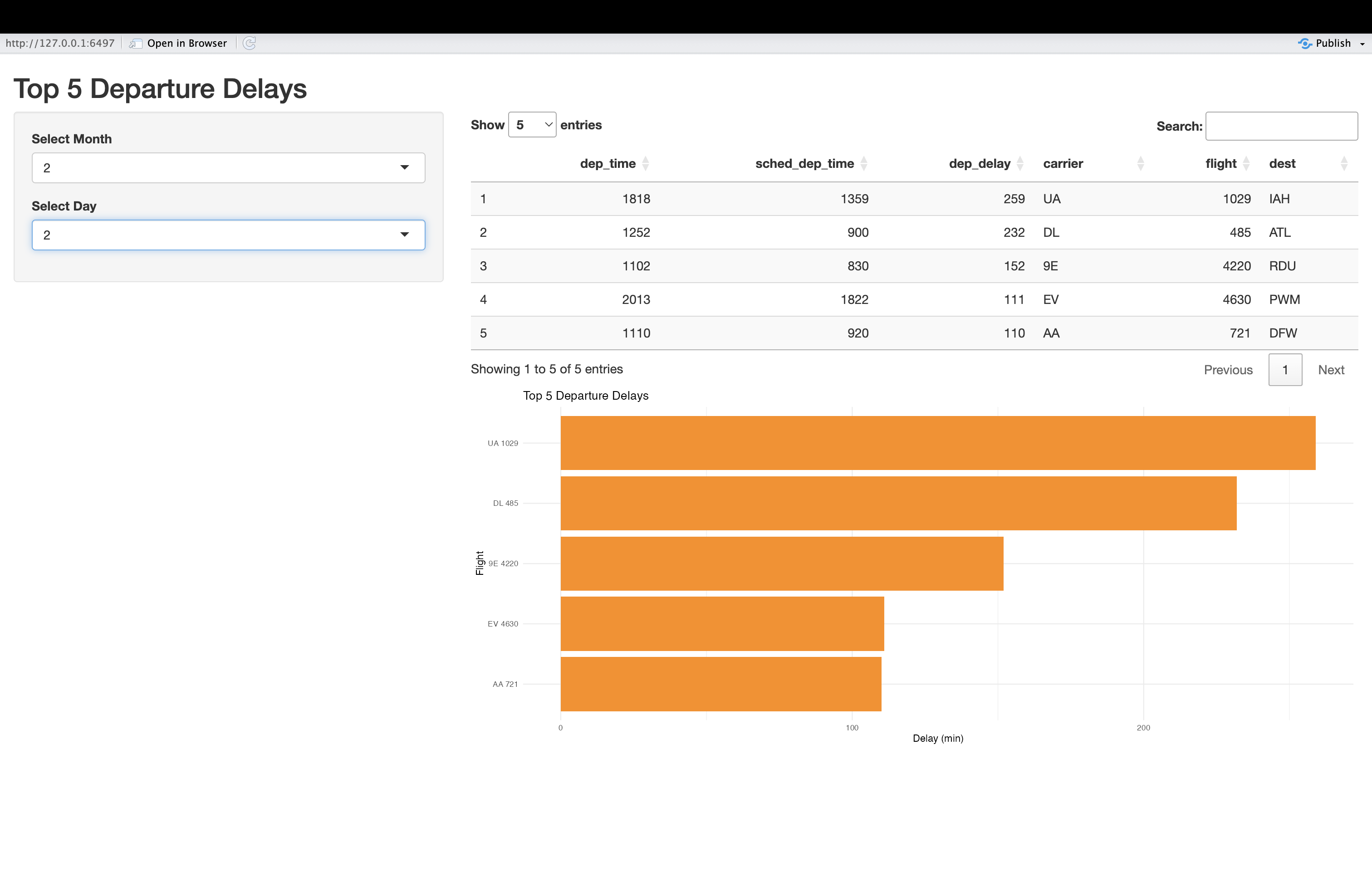
Once it’s launched, you should change the inputs and confirm that the outputs are responsive to these inputs.
Challenge 1: Enhance the flight delay app
In this challenge, you will enhance the app we just created, both functionally and stylistically, using your knowledge of Shiny’s features and tools. Please modify and/or add to the flight delay app’s code in order to accomplish the following:
- Add a button labeled “Display” that users must press after specifying their desired input parameters in order for the app to update.
- Add an additional input filter (you can choose a widget of your choice) that allows users to filter observations by the originating airport (the “origin” field)
- Apply a theme of your choice from the shinythemes package to improve the appearance of the app.
The code below makes these changes. It uses the “paper” theme, check
box filters to capture user preferences on the airport(s) of interest,
and uses eventReactive() to activate updates when the
button, created by actionButton(), is clicked.
R
ui <- fluidPage(
  theme = shinytheme("paper"),  # paper theme

  titlePanel("Top 5 Departure Delays"),

  sidebarLayout(
    sidebarPanel(
      selectInput("month", "Select Month", choices = 1:12, selected = 1),
      selectInput("day", "Select Day", choices = 1:31, selected = 1),
      # adds check box input to select airport; default is to have all options selected
      checkboxGroupInput("origin", "Filter by Origin Airport",
                         choices = unique(flights$origin),
                         selected = unique(flights$origin)),
      # adds "Display" button
      actionButton("go", "Display")  # Action button
    ),

    mainPanel(
      DT::dataTableOutput("delay_table"),
      plotOutput("delay_plot")
    )
  )
)

server <- function(input, output) {

  # Use eventReactive to delay updates until button is clicked; extract records associated with the   # month/day/airport desired by the user
  filtered_flights <- eventReactive(input$go, {
    flights %>%
      filter(month == input$month, day == input$day) %>%
      filter(origin %in% input$origin) %>%
      filter(!is.na(dep_delay))
  })
   # creates table of the flights with the five longest delays on the user-specified day and
   # populates "dataTableOutput" in the UIairport(s);
  output$delay_table <- DT::renderDataTable({
    filtered_flights() %>%
      arrange(desc(dep_delay)) %>%
      slice_head(n = 5) %>%
      select(dep_time, sched_dep_time, dep_delay, carrier, flight, origin, dest)
  }, options = list(pageLength = 5, scrollX = TRUE)) # specifies behavior and appearance of table

   # creates inverted bar plot of flights with the five longest delays on the user-specified day and    # for specified airport(s)
  output$delay_plot <- renderPlot({
    top5 <- filtered_flights() %>%
      arrange(desc(dep_delay)) %>%
      slice_head(n = 5)

    ggplot(top5, aes(x = reorder(paste(carrier, flight), dep_delay), y = dep_delay)) +
      geom_col(fill = "darkorange") +
      coord_flip() +
      labs(title = "Top 5 Departure Delays", x = "Flight", y = "Delay (min)") +
      theme_minimal()
  })
}

shinyApp(ui, server)
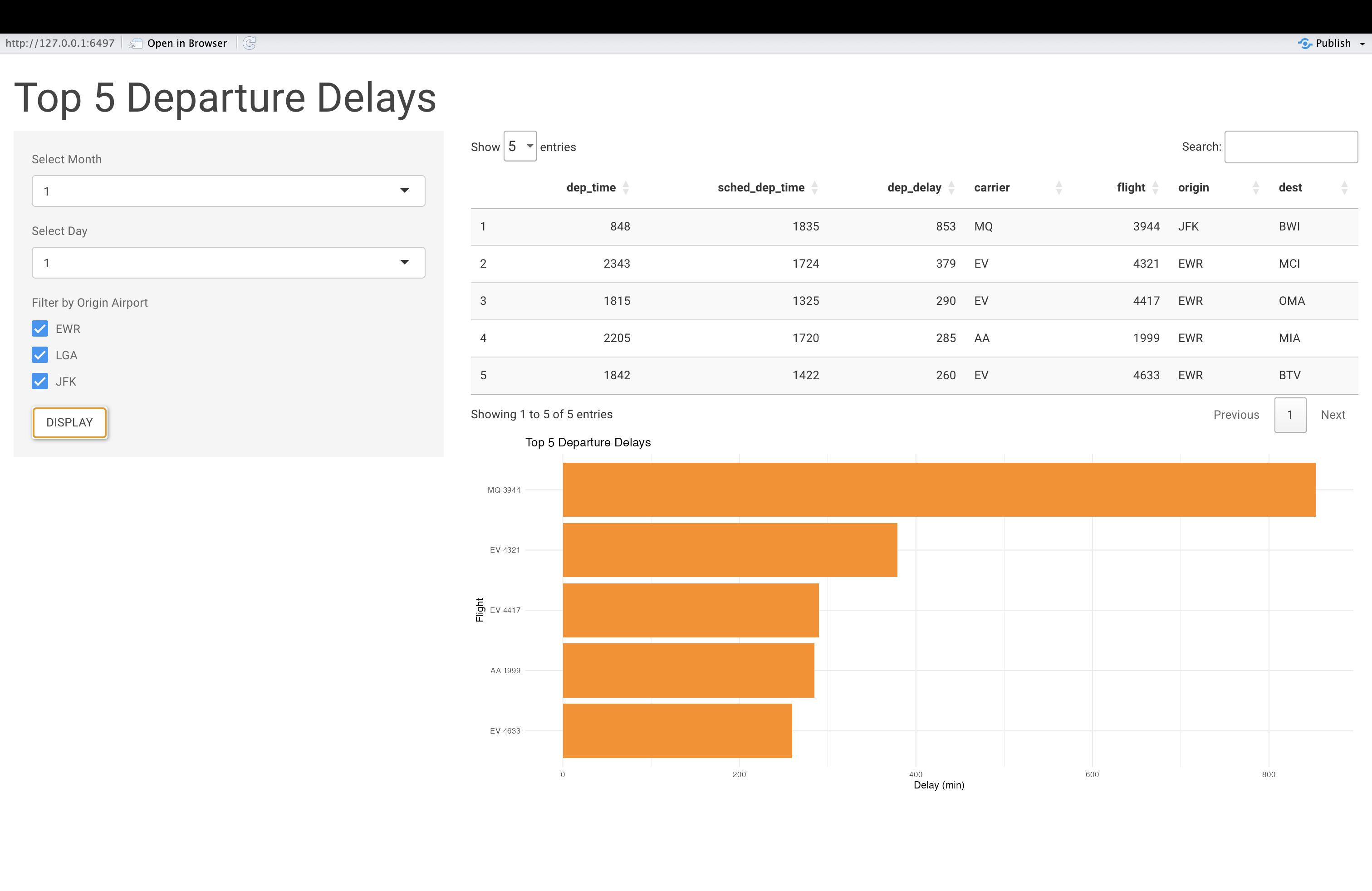
When launched, the app will look something like this:
Did you know?
You can configure your Shiny apps to allow users to download data
from your app, based on their queries. For example, using the
downloadButton() (in the UI), and
downloadHandler() in the server, you could create an
application feature that allows users to download a CSV file of the top
5 delays based on their selected filters. If you’d like to learn more,
consult the documentation for these functions, and see if you can add
this feature to the app.
test
- Shiny applications can offer an accessible and interactive entry point into tabular datasets; you can build such applications using only the concepts and tools introduced in the previous Episode
- R Studio’s Shiny web application template can help save you time in writing applications; start with the template, and swap in the functions needed for your specific applications
- It can be helpful to verbally conceptualize and outline your application before writing the relevant code
- To add tabular information to the Shiny application UI, it’s
recommended that you use the DT package’s
dataTableOutput()(in the UI) andrenderDataTable()(in the server) functions.